
Good Design vs Bad Design: See the Difference
What is good design? Is it beautiful? Innovative? Or, functional?
According to Dieter Rams, it’s all of the above.
Dieter Rams is a German industrial designer, who has had a profound influence on the niche. He worked as a head of design at Braun for 30+ years, so most of their products have become iconic in no small part due to Rams’ vision. Based on his experience, Dieter Rams has outlined 10 principles of good design.
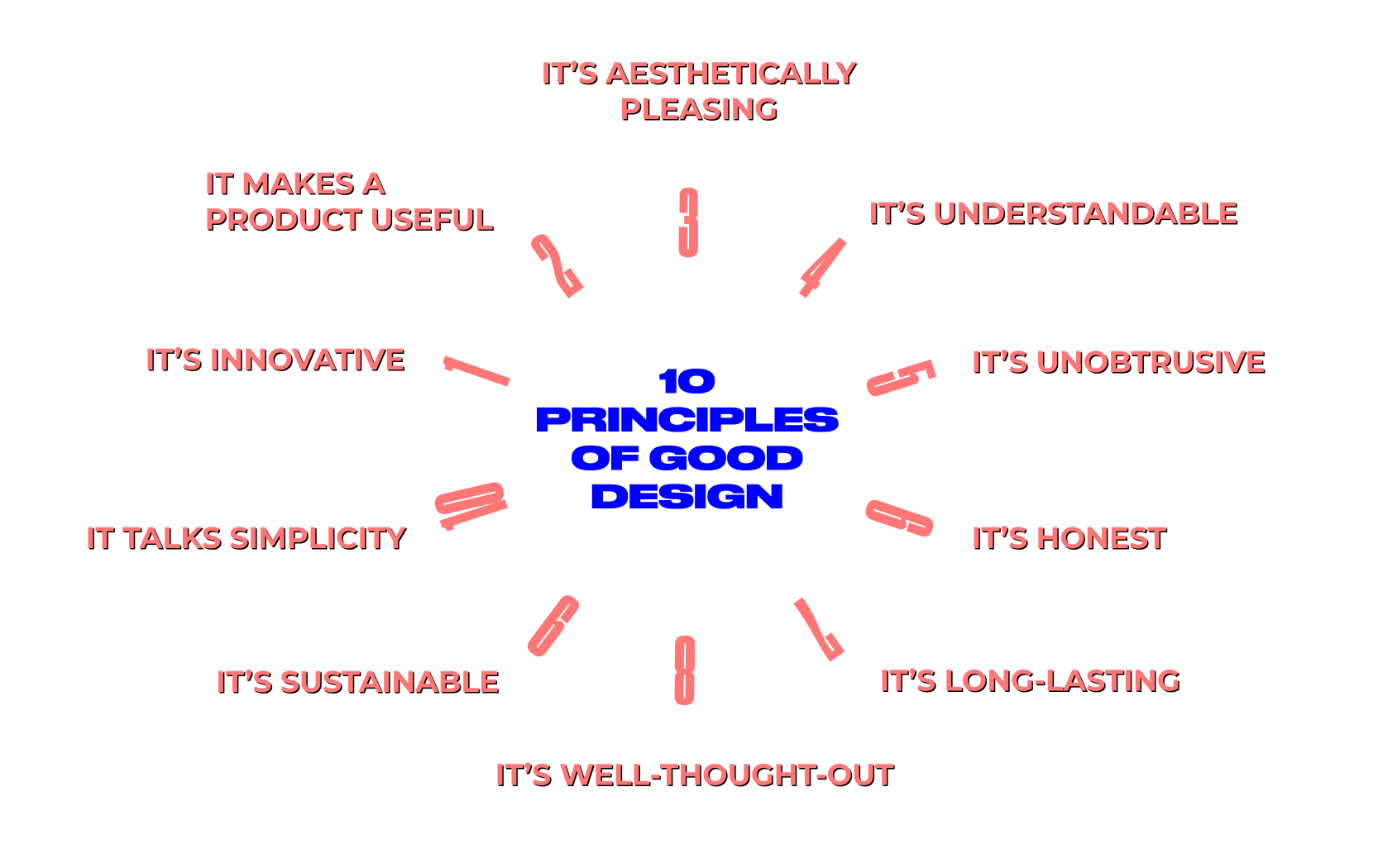
Although Dieter Rams specialized in designing consumer goods, it’s fascinating to see how well his vision applies to modern websites and apps. He has basically established the less-but-better approach to design that we all follow now.
In this article, we won’t be talking about the aesthetic side of design — tastes differ. Instead, we’ll focus on its usefulness — one of the core design features emphasized by Dieter Rams. After all, “design should help people. That’s its role.”
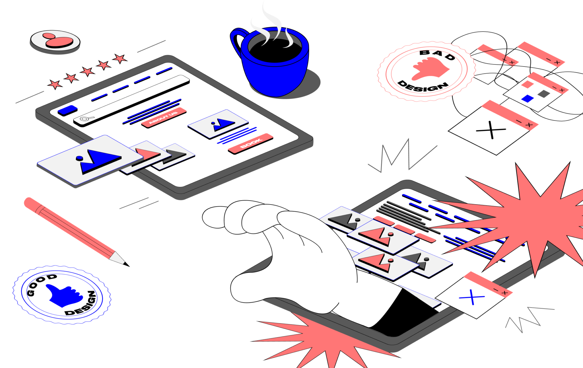
How to tell good design from bad design?
Sometimes, digital product designers neglect the above fundamentals and shift focus to building something totally different, trendy, and artistic. As a result, they end up with a product that no one wants to use. Why so? — Because “products have to be designed in a way that they are comprehensible.” Sure, it doesn’t mean that designers should neglect its visual appeal. Good design is all about creating aesthetically sophisticated, functional, and intuitive interfaces. We always keep that in mind when assessing the product’s design, and we suggest you do the same.
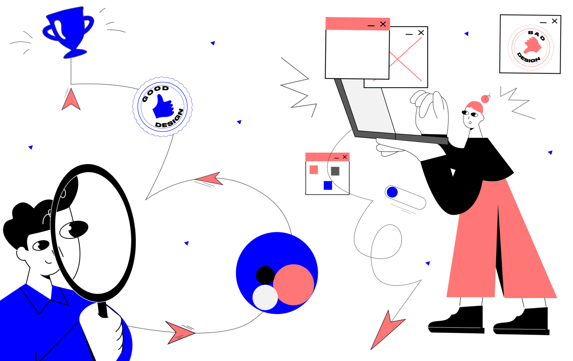
As a digital product design and development company, CXDojo has had a chance to work on many projects. And a good deal of them involved redesign efforts. Every time we conduct yet another UX audit for our clients, we uncover all the same design flaws. This is what motivated us to compile this ‘good design vs bad design’ guide.
We will consider the examples of good web design and bad web design in the context of important user interactions that are similar for most sites.
First visit
First impressions matter. In interpersonal relations, it helps us make a judgment about someone we encounter for the first time and decide whether we’d like to maintain contact or not. It works the same way for a brand. But in the case of business relations, it dictates whether a random visitor will convert into a customer and bring revenue or not. And you have only 7 seconds to make that first user interaction positive.
Good design vs Bad design
At this stage, the user only scans the pages and doesn’t go deep into exploring your services. This is when they get acquainted with the brand and decide whether your website or app deserves trust. They are looking for certain anchors that prove you are real. But what makes a company real in the eyes of users?
- Company-related info. Tell how you started, what your values are, and what your mission is. Let the user hear your voice, and it’s better if your voice is human-like, and not keyword-stuffed. You are telling your story in order to impress the user, and not Google, in the first place. That way you show respect towards potential customers, and therefore, have every chance to win their hearts.
- Team. This is the face of your company, so make sure to add real photos of your team members. Avoid using stock images. It’s not just an example of bad design, it’s unacceptable in the age when almost everyone has a phone and can take pictures of decent quality. Don’t be afraid that such photos might look not so sleek and polished — on the contrary, they humanize your brand and bring it closer to the user. In order to further strengthen this emotional bond, include links to social profiles of your team and your company so that the user can relate to your brand even better.
- Reviews. User-generated content reflects transparent opinions, photos, and ratings from verified customers. This not only proves that your company is real, but also influences the buying decisions of the site’s first-time visitors. A good website design practice is to make leaving reviews possible on your site or pull them from external review platforms like Google Business, Trustpilot, Yelp, or niche-specific ones like Tripadvisor. Make sure to showcase diverse reviews — positive, neutral, and even negative. Although it may seem counterintuitive, but it can indeed enhance user trust. Opinions differ, and that’s totally fine.
- Contacts. Easy access to contacts makes the company legit in the eyes of users. It shows that you care. Let’s say users couldn’t find the necessary information, faced a unique problem, or simply got confused about where to go next in their journey. Even good designs can’t make provisions for all non-standard user scenarios. In this case, communication channels such as a bot, phone, or FAQ section can get you covered. Yet, avoid being too intrusive — don’t cram each and every page with such info all at once. It shouldn’t distract the user from performing major target actions, but it should be at hand in case any micro-challenge arises.
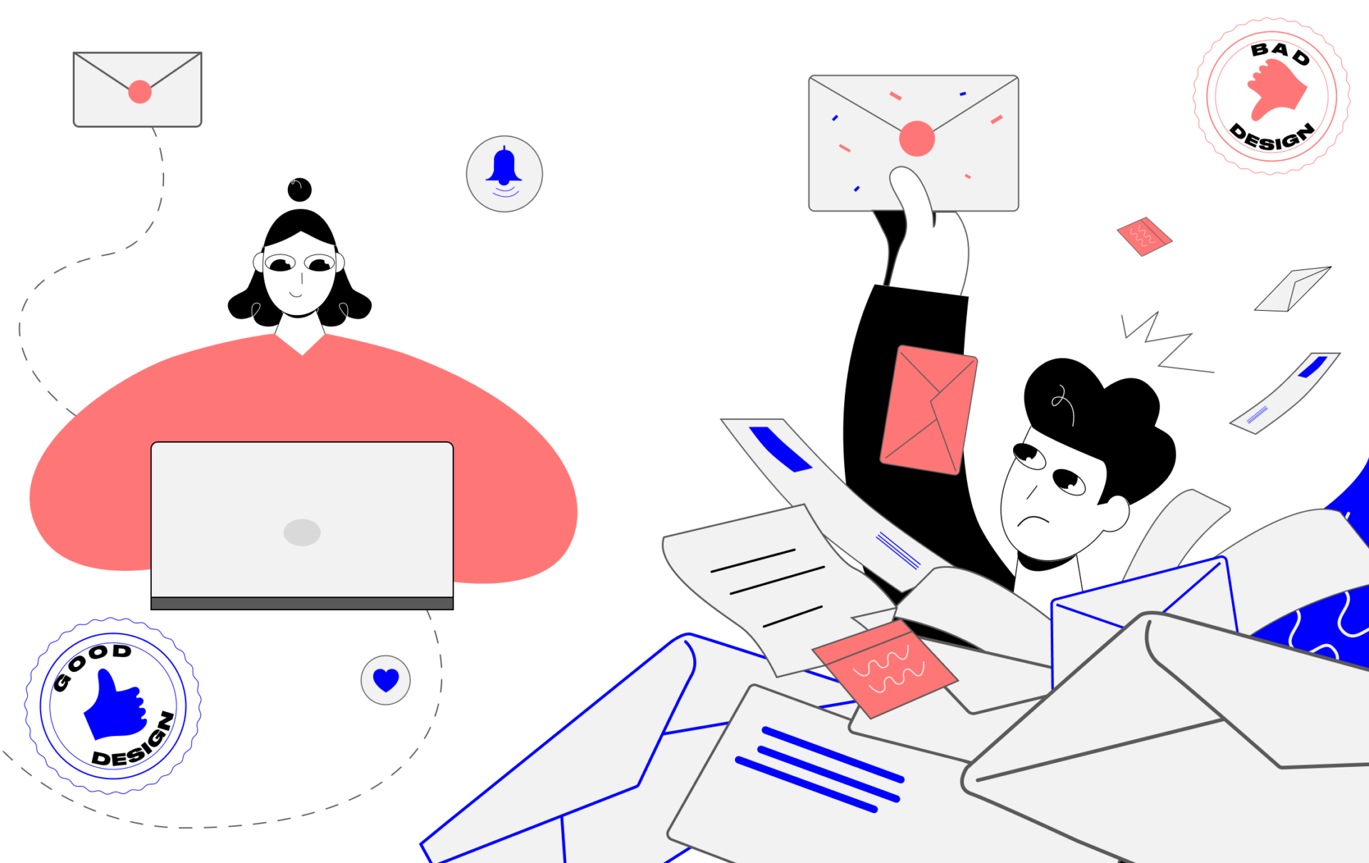
Search
The search bar brings site visitors to where they want as quickly as possible. In fact, it’s the most used element of the interface, which means visitors treat it as an assistant in performing their target action. And if you don’t help users get what they want fast, they will leave you for good. So you can’t afford to neglect the search bar design.
Good design vs Bad design
Imagine the following situation. You’ve landed on a website, crawled its main page, and decided to delve deeper. You are still new to the interface and not quite sure where to learn the information about certain products or services. You are entering a query in the search field in a bid to get to the desired destination. But all you get is a blank error page.
Is it because of a bad query or bad design? — The latter, for sure.
If you want to get conversions, and not churns, you have to stick to one golden rule. When designing a digital experience, it’s essential to make users feel as if they are always progressing on their journey. Don’t let the user take a step back, because it will inevitably lead to frustration. Here are some tricks for making the user’s search experience an easy ride:
- Tooltips. When interacting with the search bar, people appreciate it when they are given some hints — e.g. popular or similar search queries, categories, products, associated goods and services, keywords, etc. Present them in the form of dropdown lists, but avoid making them too long as the user can easily get distracted.
- Filter. You can implement either a basic filter or an advanced one — it depends on the services or products you provide. Let the user customize their queries as they see fit. This will help them find what they are looking for fast and strike a deal with your company in a matter of clicks. It’s a win-win if you have a wide variety of goods and services with different parameters. If not, ignore this tip. Every element of the user interface should be there for a reason, and going over the top is never a good idea.
- Suggestions. Unsuccessful search results are inevitable, yet they can also be engaging if your site has a good UX design. Provide the user with alternatives — i.e. similar product suggestions or at least instructions on what to do next — but never with a blank page. Another effective way to compensate for the disappointment caused by unsuccessful search results is to use a context-relevant animation. Your goal is to keep the user on the site as long as possible and bring them closer to a conversion goal.
- Responsiveness and support. Along with suggestions or instructions on the search results page, you can also add an option to contact a customer support representative online, who is there to help 24/7. Also, make your interface respond to successful or unsuccessful user actions by means of notifications, hints, or animated microinteractions.
Registration
90% of websites offer users to register an account with them. This is because registration acts as a gateway to a wealth of user data that can further be leveraged to personalize the content you offer and effectively push the user down your sales funnel. Although registration is now commonplace, many websites are still unable to do it the right way. A bad design of sign-up forms can result in an increased bounce rate.
Good design vs Bad design
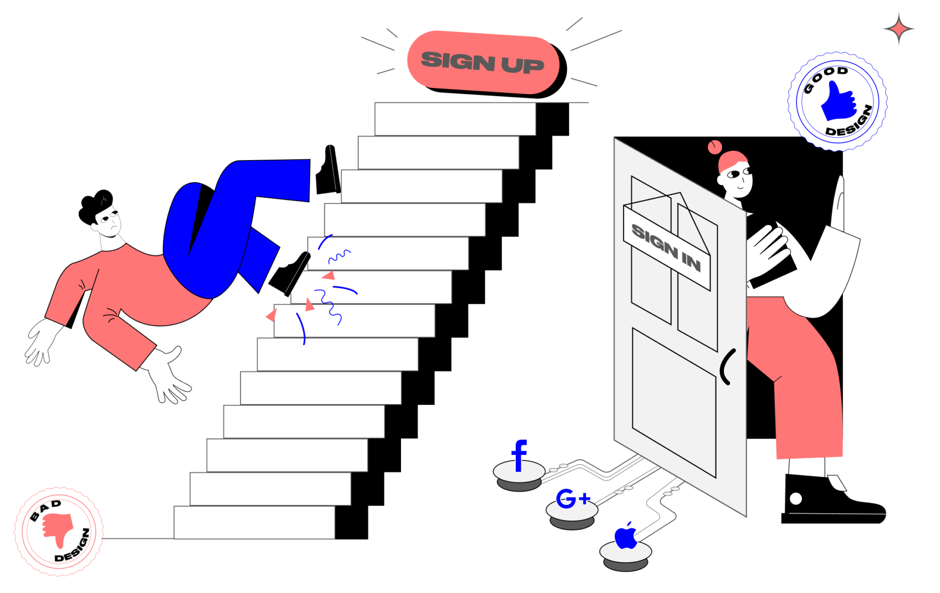
Sign-up forms have many uses. For some, it will be enough to ask for the user’s email only, while other companies may require extra information to fine-tune their services to user needs. So the approach to designing a form for a bank site may differ from the one used to design a form for an online magazine. Yet still, users are unwilling to fill out forms as it requires time and personal information. Also, they are wary of leaving their email in such forms because they think they will be bombarded with junk mail. How to convince the user to register then?
- Give value. Show the user that the benefits of registration will be more tangible than the potential discomfort. Let them know that they’ll get access to advanced functionality, exclusive offers, or free bonuses. It still works these days.
- Keep it simple. Include as few fields in a sign-up form as possible and remove all optional fields. If it’s optional to do something, the user will never do it. You can collect additional information later by offering the user to complete their profile or getting insights from analytics.
- Allow social access. Almost 60% of people around the world now use social media. Being able to register with a Google account, Apple ID, or any of the social profiles will make it easier to interact with the site and become a time-saver for the user.
- Divide it into steps. If it’s not possible to reduce the number of fields, you can still visually minimize the form by dividing it into steps. It’s important to notify the user of their progress during the fill-out process. For instance, you can tell how many steps and how much time are left, or add a progress bar to show the status of the ongoing process. This gives the user a sense of emotional fulfillment.
- Optimize the process. If there’s something you can automate, do so. For instance, you can help users complete their forms by auto-filling certain info — e.g. geographical location, preferred language, etc. Also, make sure that the form autosaves the entered information. Otherwise, if the page gets refreshed, the user will have to refill it over and over again. Frustrating, right?
Note! Good UI design accounts for mental patterns. For example, people are used to seeing a sign-up button in a visually familiar place, i.e. in the top right corner of the header. So make sure it is located there. That way the user does not have to spend extra time searching for the desired function and can immediately proceed with performing the target action. Also, make the sign-up function accessible from any page of your website.
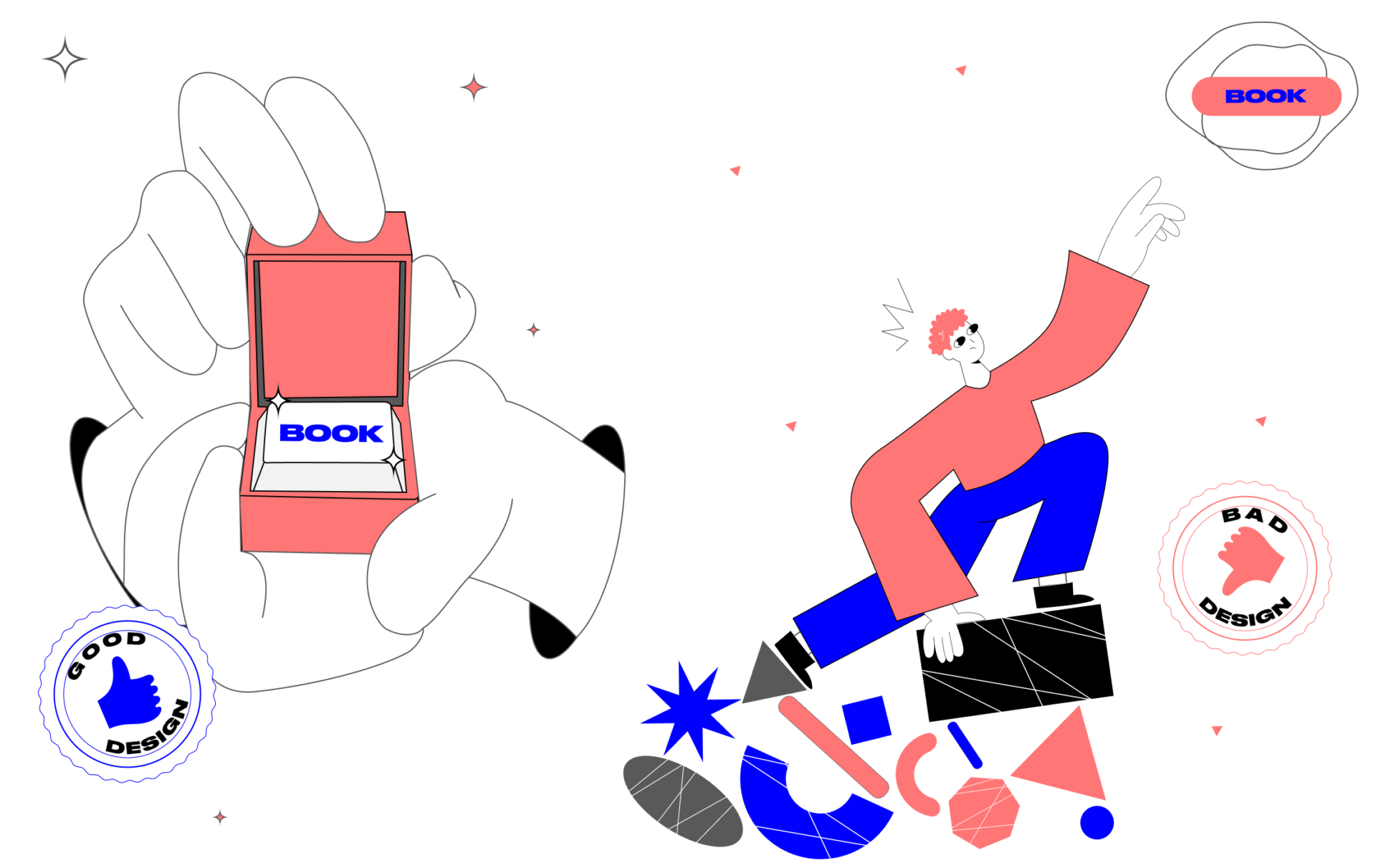
Subscription to a newsletter
Newsletter is an excellent method of enticing users that you haven’t managed to entice during their early interactions with a website. With it, you can carry out campaigns about product launches, special promotions, and important company updates. But as a rule, persuading the user to subscribe to a newsletter is even more challenging than persuading them to register. And it’s easy to learn why.
Good design vs Bad design
What do users find the most annoying about the subscription form? It is often too intrusive. It pops up here and there, overlaying the page and distracting from browsing a website. As a result, the only desire it inspires is to never subscribe to that website.
If your business relies heavily on subscriptions in terms of either revenue or marketing, follow the below tips to nail its design.
- Wait. Most of the visitors are new to your site and they don’t have a clue what it is about. Don’t spit the subscription box in their face the very moment they’ve landed on your site. Let them first explore it for a while to grasp the value.
- One time is enough. People are sick of pop-ups, so why irritate them? Unless your tactic is to annoy users into surrender, don’t show the subscription pop-up multiple times. One time is enough, but make sure that a pop-up copy tells the user where they can find the subscription function later. This can be a button in the header or footer, or a section in the profile settings.
- Be transparent. Users appreciate it if you respect their time and the right to consume the info they want. Let them know what type of content you are going to send and how often, before they subscribe. Also, notify the user of the opportunity to unsubscribe whenever they want and how they can do it.
- Give users control. A good solution is allowing the user to choose the topics of interest for the newsletter. Firstly, it makes the content personalized; secondly, it increases user engagement and thus, conversions.
For a good while, designers have been using a sidebar to locate ads, banners, and, of course, subscription forms. It worked — but a good while ago. Now, it’s a bad design example. Over time, users have learned to ignore that area, because it contains irrelevant information. This phenomenon is called “sidebar blindness.’’ So it’s better to avoid adding a subscription form there.
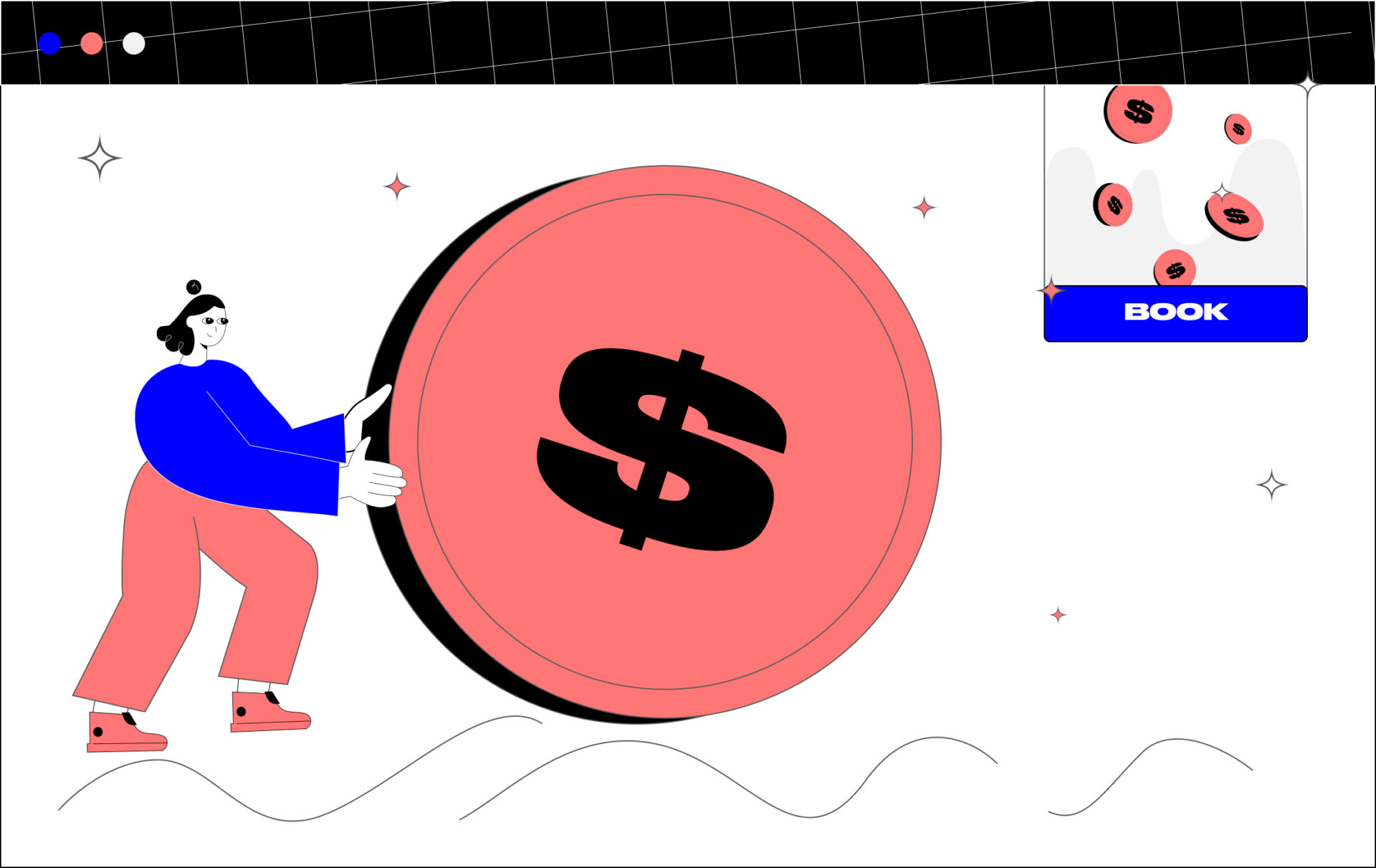
Purchase
Here we have it — the conversion goal for the service of which all business websites are created. Altruism aside, businesses are created to make money and a good website design can contribute to it. Even a minor design flaw at this stage can result in huge losses.
Good design vs Bad design
Do you know travel website Expedia? They had to learn the cost of a bad website design first-hand.
Using analytics, the company’s experts realized that they needed to reconsider the design of their checkout form. Somehow, many customers who clicked the buy button never completed the order. When they started digging into the reasons, it turned out that one field was misleading for many users. The form had optional field ‘Company’ and customers believed this field required their bank name. After inputting it, they proceeded with the next field, which was ‘Address’. And intuitively, they entered the bank address — while in reality, this had to be their home address. As a result, the credit card verification process failed due to a wrong address. After Expedia deleted that field, their annual revenue increased by $12 million!
What lessons can you learn from the Expedia case?
- Once again, get rid of all optional fields in the form. They not only require extra time for filling, but they can also lead to user churn. Keep the number of fields to a minimum. After all, the faster the user completes the order, the better.
- Add field hints. Inform users about the field role by giving them a clue or instructions on what is needed. You can implement the contextual help as text below the field or as a pop-up.
- A/B test. If you have doubts as to whether your purchase form is effective, make sure to verify it. With A/B testing, you can check two or more form variants with real users and then compare their performance against each other.
There’s another important point in designing a checkout experience. Always account for more than one user journey towards the purchase. Ideally, your customers should have a chance to proceed with ordering from any page of your site — be it via a sticky header, banner, or a contextual CTA button.
Good design = good user experience
Bearing in mind Rams’ principles and the above examples of good UX design, we can elicit the following best practices for designing digital product experiences:
1️⃣ A good web design process starts with user research. The product is created for users; and if you don’t understand users and the reality they live in, you won’t be able to design a product that can improve their life. The design revolves around user needs and goals they want to achieve by means of your product.
2️⃣ Nothing should block the user’s journey across the product. It should have a clear information architecture and self-explanatory features. Navigating through the interface should not require extra thought on the part of the user. So if you believe that something is obvious when designing a product, think again and optimize it (remember the Expedia case?)
3️⃣ Any element of a product design should be there for a reason, and not just for the sake of aesthetics or because it is nice to have. If it doesn’t help the user achieve their goal, it is an unnecessary extra that negatively affects the user experience. Get rid of it.
4️⃣ Good website designs facilitate interactions with the product. Don’t neglect conventional design patterns and recognizable interface objects. Users will enjoy interacting with your product if they can intuitively deduce what to do with it at every step.
5️⃣ The key to customer loyalty is trust. Show users that you care by interacting with them — i.e. responding to their queries, guiding them through potential bottlenecks, celebrating their accomplishments, and rewarding them for their effort. Be transparent about your team, activities, goals, etc.
After all, why do people buy products or services? — To use them. And they want the process of using to be smooth and fit for the purpose. That’s the foundation for a good user experience, and thus, good design. Keeping that in mind, can you assert with confidence that your website design is good?

Author

Related resources
 June 29th, 2022 / 13 min
How to Save on UI And UX Design? — Know Your Needs
Don’t fall for design companies that tout uniform solutions. Fall for those who recognize your product's unique needs.
read
June 29th, 2022 / 13 min
How to Save on UI And UX Design? — Know Your Needs
Don’t fall for design companies that tout uniform solutions. Fall for those who recognize your product's unique needs.
read
 November 24th, 2021 / 23 min
TIPS ON USER EXPERIENCE AND USABILITY, OR HOW TO MAKE CUSTOMERS LOVE YOUR PRODUCT
The key factor that affects your digital product’s success is user experience and usability. So pay increased attention to it.
read
November 24th, 2021 / 23 min
TIPS ON USER EXPERIENCE AND USABILITY, OR HOW TO MAKE CUSTOMERS LOVE YOUR PRODUCT
The key factor that affects your digital product’s success is user experience and usability. So pay increased attention to it.
read
 February 23rd, 2022 / 18 min
9 SECRETS OF EFFECTIVE COLLABORATION WITH A UI UX DESIGN SERVICE PROVIDER
For the product to communicate your custom message, you, as a business owner, should take part in designing it from day one.
read
February 23rd, 2022 / 18 min
9 SECRETS OF EFFECTIVE COLLABORATION WITH A UI UX DESIGN SERVICE PROVIDER
For the product to communicate your custom message, you, as a business owner, should take part in designing it from day one.
read
OUR RECENT PROJECTS
- gaming app emulator
- logo concept & design
- brand identity
- brand book
 Enhancing Platform Usability with UI/UX Design
- gaming app emulator
- usability improvement
- data hierarchy
- visual design