How to Save on UI And UX Design? — Know Your Needs
We all know the examples of impeccable product design — such as Disneyland with its omnichannel experience or Amazon with its customer-centrism. Such products set the pace for the entire market today.
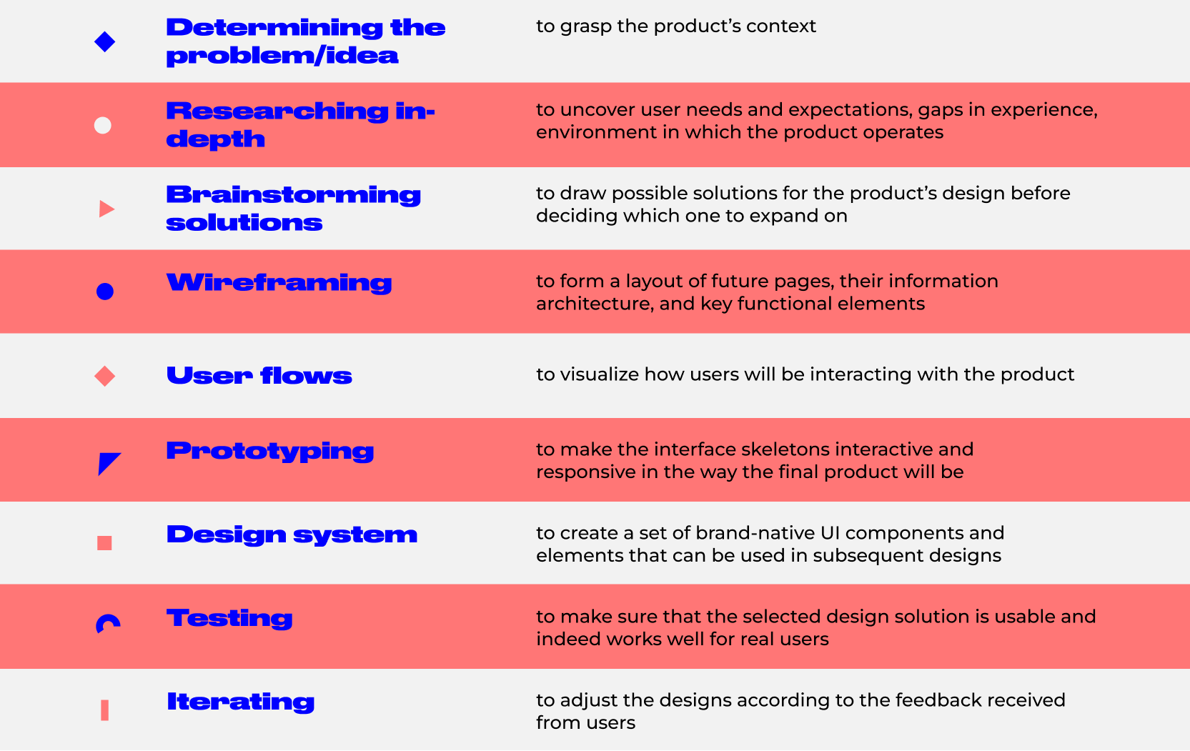
UI/UX design steps
Seeing this, businesses no longer treat UI and UX design as simply an extra that their products can do without. Instead, they recognize its value in attracting and retaining customers, and therefore, are ready to pay for it. Certainly, it’s a positive shift that points toward the growing awareness of how important the design is for digital product success in the eyes of decision-makers.
Some business owners even go the extra mile and educate themselves on the established design process before they hire a UI designer. Here, at CXDojo, we stick to the following essentials that make up the design process. These steps are carefully distilled from years of experience in creating UI/UX design projects.
With that in mind, the price tag of $10,000-$30,000 for the UI & UX design project may seem reasonable enough as it involves lots of intermediary steps and thus, human effort. Right?
We hate to break it to you, but the above steps are all subject to prioritizing. It is possible to save time and money on one step, and focus more effort on the other one, or skip some of them if your project dictates so. Besides, even if you diligently get through all of them, this doesn’t necessarily result in product success. The design may look and feel perfectly well, but the post-launch analysis of target interactions may point toward specific overlooked details that now affect users’ perception of the product’s value. As a result, you have to roll back and make another try.
The UX & UI design process is never uniform
In practice, the process of app or web UI/UX design is difficult to standardize for all projects. Instead, it is flexible and thus, allows for modifications as long as it matches the project goals. Thus, the UI and UX designer often plans their efforts according to the product’s unique characteristics, and hence, adjusts the process and cost to the client’s custom needs.
Here are a few scenarios that prove this point.
A pure idea that needs fast validation
This is how it often starts. A bright idea for a new product strikes you, you are contemplating it for a while, and once all the puzzle pieces in your head fit together, you start looking into the ways of implementing this idea. However, chances are your idea seems bright only to you, while customers find it offbeat or unclear. So, treat it as a hypothesis that must be proven either right or wrong. At this stage, speed is your best friend.
In this case, a simple landing page or a two-screen app will do. To create it, designers don’t need to perform in-depth market research, engineer the intricate user journey maps, or sweat over visuals. Instead, they’ll focus their efforts on designing user flows and wireframes that can further be handed over to developers. And then, they can quickly test it with real users to get important insights.
By reducing the UI and UX design cycle at this stage, you save a ton of money and also gain time for repeated hypothesis testing if necessary. This test-and-learn method is effective not only for startups. It is widely used by successful enterprises too. When exploring new paths for growth, they set up experiments and learn from their results where to go next and whether the idea is viable at all.
Focus on: user flow, testing, iterating
The validated idea that needs early adopters
The biggest mistake that most entrepreneurs make at this stage is investing in full-featured UX and UI design. There are still lots of uncertainties on your way that translate into likely product iterations. You don’t want to find out that you have to redesign the product’s entire feature set or even pivot when you’ve already run out of the budget and spent months on creating it. Instead, shortening the time-to-market will deliver a substantial competitive advantage. Therefore, settle on the must-have features of your product and proceed with their design. Should-have and could-have features can be added later.
Take TikTok, for example. It is now one of the social media giants that boasts 1 billion monthly active users. But few know that it originates from a near-miss edutainment app, Musical.ly. Originally, the app was designed for sharing short 3-to-5-minute explainer videos created by educators for teens. They spent over $200,000 and 6 months on building the app only to learn that it is a failure — both in terms of the mechanics and audience. Having only 8% of the budget left, the founders decided to pivot. If they had launched a basic app first, the losses might not have been so striking.
Nevertheless, even though this is a basic product version, its UI and UX designs should be well-thought-out and clean. After all, you have to deliver it to the market and acquire early adopters. Yet still, you can save on the app UI design tweaks like animations, gamification, or micro-interactions. They do increase user engagement but can be pricey due to their design complexity — and honestly, you don’t need them at this point.
Focus on: all steps; yet design a product with minimum features
The early product that needs enhancing
So you’ve tested the waters, acquired early users, and now, want to foster their loyalty and grow the current customer base more extensive. What should you do? — Analyze, improve, and then, analyze again.
Best UI designs are data-driven, meaning any design improvement is a result of an analytically informed decision. Under this principle, ‘making that button red because it is believed to attract the user’s attention’ doesn’t work. The designer should have a better reason for this change. They should know exactly why users will benefit from it and whether your app or web UI design needs that button at all. Design should serve a certain purpose and solve a certain problem users face. If it doesn’t, it is just a random collection of buttons, graphic elements, and blocks.
At this stage, the team often performs usability testing, UI/UX reviews, or customer surveying. Once the designer uncovers problems and spots opportunities for design improvement, they try to get to the root of the problem and think about methods of solving it in the given context — one by one. To ensure that the newly designed solution is the proper thing, A/B testing is recommended.
Enhancing design does not involve a complete redesign of your app or website. It is the process of making particular improvements. So be wary of UI/UX design agencies that insist on redesigning your product from scratch without good backing for such a decision. Redoing the whole thing is often easier, than bettering it. And it is, of course, more expensive…
Our advice here is to work on a pay-per-sprint basis. Agree on a tangible deliverable for each sprint, create a clear backlog of tasks, and pay sprint by sprint.
Focus on: research, prototyping, testing, iterating
The established product that needs a redesign
One common misconception many clients have is that the design project ends after the release. No, it doesn’t. UI/UX designs require regular polishing to meet the dynamic needs of today’s customers and thus, maintain the brand’s competitive edge.
Redesigning a product is indeed a comprehensive process. As a rule, it involves the product’s visual refresh, rebranding, and restructuring. In other words, it translates into massive changes to UI and UX design. Yet still, the core functionality of your product will be the same, so the designer can use the existing layout and improve upon it based on the user’s key target actions. This means that the time spent on steps like wireframing can be reduced to a minimum.
To understand how to better match your customer’s evolving expectations, the designer should be well aware of what those expectations are and who your customer is. User personas, interviews, customer satisfaction studies, and focus groups are all helpful in this regard. As an established company, you most likely have a marketing department that promotes your business. The primary task of the marketing team is to monitor customer experience with your brand. And we bet they regularly perform solid research that contains a ton of insights about your target audience, analytics on what works well, and directions you want to expand to. Just hand over this data to the design team and they’ll put it to good use, without spending time on in-depth research on their own.
Focus on: brainstorming, prototyping, testing, iterating
Summing up
It’s just a small portion of all those scenarios that we’ve dealt with. Every client has specific business pains that require a feasible solution. That’s why we tailor the design process so that it falls within the client’s timeframe, budget, and goals. After all, these are the guiding principles of our CX-aware approach. We strive to move beyond the role of a task performer, and instead, evolve into a partner, who is able to give sensible advice. This is the reason why we start any project — be it CTO as a service, UI and UX design, or software development — by immersing ourselves in the client’s business and its operating environment.
That said, don’t fall for UI/UX design companies that tout uniform solutions. Fall for those who recognize the uniqueness of your product needs and organize the design efforts accordingly.
Author
back to all postsOUR RECENT PROJECTS
 Enhancing Platform Usability with UI/UX Design
- gaming app emulator
- usability improvement
- data hierarchy
- visual design


