From Scratch
PROJECT SUMMARY
CHALLENGE
Create complete brand identity from scratch
PRODUCT
An endorsement platform for independent professionals
DELIVERABLES
Articulated brand design vision; ready-to-use brand identity elements; design foundation for the platformCLIENT REVIEW

Paul M
CEO, Endorsement PlatformI really appreciate how involved they are in the project. They integrate themselves into each process to see all interdependencies and make sure they coordinate efforts effectively. A true partner, CXDojo is hands-on, available, and transparent.
OVERVIEW
Our client is a professional recruiter with years of experience. Over his career, he has filled lots of positions for corporate customers from various industries. Despite his successful track record, our client had difficulties proving it with anything but his own words. This is when he came up with a product idea. Why not create a tool that would help recruiters showcase their proven reputation?
The client turned to CXDojo with this idea in mind and asked our team for technical consulting in the first place. However, after a series of consulting sessions, he decided to delegate a full-cycle product design and development to CXDojo.
CHALLENGE
The client didn’t have any supporting materials or pilot versions of the product — just an idea and an early vision. Basically, he was looking to solve the pain point he himself faced. But there was no proof that this solution would be viable for other recruiters as well.
With that in mind, here’s what we included in our to-do list:
- shaping up the product vision;
- formulating technical recommendations;
- creating a brand identity;
- designing an early version of the product.
SOLUTION
It’s impossible to create a meaningful product design from scratch without immersing completely into the client’s business and the environment in which the product will be operating.
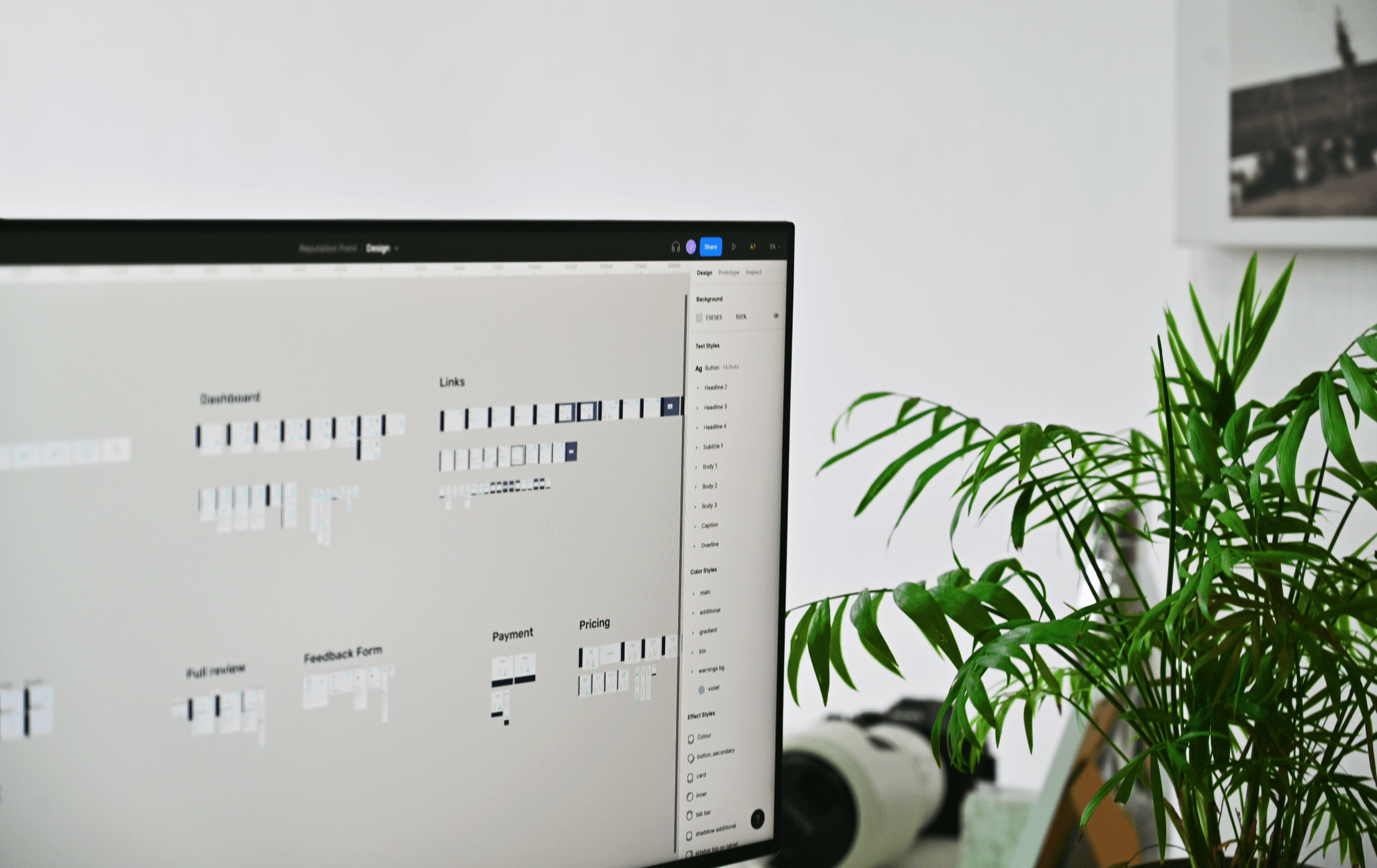
More so, in order to make sure that the brand communicates the same values, mission, and message as the founder does, we worked in close collaboration with our client.
He was engaged in all processes so we ultimately delivered a truly authentic brand identity. It meets the client’s preferences, corresponds to the nature of the product, and resonates with users.
Research
To clarify the product’s idea, we started by conducting a series of workshops. They helped us find as much information about the client’s vision, business goals, and expectations as possible.
At this stage, we identified that the product should serve as a platform for independent feedback about recruiters’ services. A recruiter should have the opportunity to create a profile and aggregate their customers’ reviews and ratings there.

We also scanned the market for products with similar functionality.
The closest possible competitors were platforms like Trustpilot, Clutch, Yotpo, etc. Yet, they are designed to showcase the reputation of companies and not individual service providers, let alone recruiters.
This research allowed our team to describe the product from a technical point of view and identify the scope of work.
Design questionnaire
Now that we had an idea of what the product should be, we had to envision what it should look like.
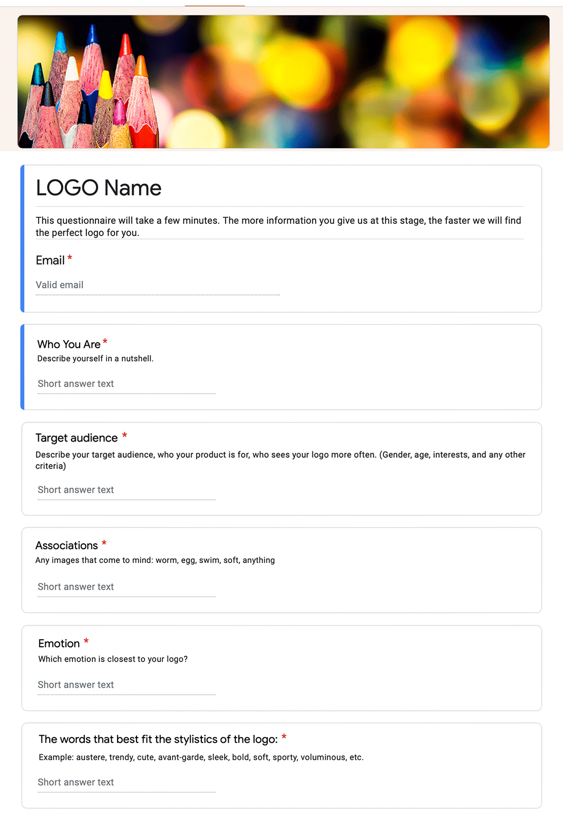
We asked the client to complete a design questionnaire, which is aimed to uncover a number of design-critical points — preferred style, desirable and undesirable colors, brand associations, examples of corporate identities the client likes, etc.
However, even if the client has an accurate design vision, it’s worth verifying whether that design makes sense for the product. That’s why we always hold an in-depth interview with the client after the questionnaire is filled out. We go into the whys behind the answers and try to understand the context of the client’s choices. This knowledge helps us find appropriate design solutions faster.
Concept & Design
Although we had a clue about the nature of the product and the client’s design preferences, we couldn’t proceed with the identity design because there was no brand name yet.
The client was struggling to choose among 3 names. We agreed to conduct a brainstorming meeting to analyze them in terms of their appropriateness for the brand. It had to be simple yet descriptive. As a result, we decided to go with Reputation Point as it communicated the brand’s essence clearly.
Logo

The brand name marked the start for designing the logo concept. In the previous stages, we found out that the client preferred logos like those of Facebook, LinkedIn, and Pinterest. They look clean, minimalistic, and modern. On top of that, they all consist of their brand names’ initial letters. To meet the client’s expectations, we took the letters R and P as a basis for the logo concept. We also decided to add the point symbol to make the logo even more meaningful. After all, the product is a meeting point for recruiters and their customers.
Color

Reputation Point is a platform for top-rated recruiters. So it should be associated with professionalism, expertise, trust, and respect. Together with the client, we came to the conclusion that the color palette shouldn’t be too vibrant or aggressive. It had to encourage users to stay longer on the page.
We opted for the following primary colors — purple, navy blue, and green. To emphasize that Reputation Point is a place where recruiters showcase their growth, we decided to add a gradient. It symbolizes their gradual transitioning from junior to senior specialists.
Font

From the very beginning, we were striving to create a design that is neat, uncluttered, and contemporary. Typography should have complemented the overall look and feel of the brand.
The font that seemed the most consistent with brand elements was Rubik. It has thin lines and slightly rounded corners.
Web Platform
Once we finalized the brand style, we started working on platform prototypes. Early on we agreed on developing an MVP first, which implied creating only basic functionality. Therefore, the number of screens we had to design was limited.
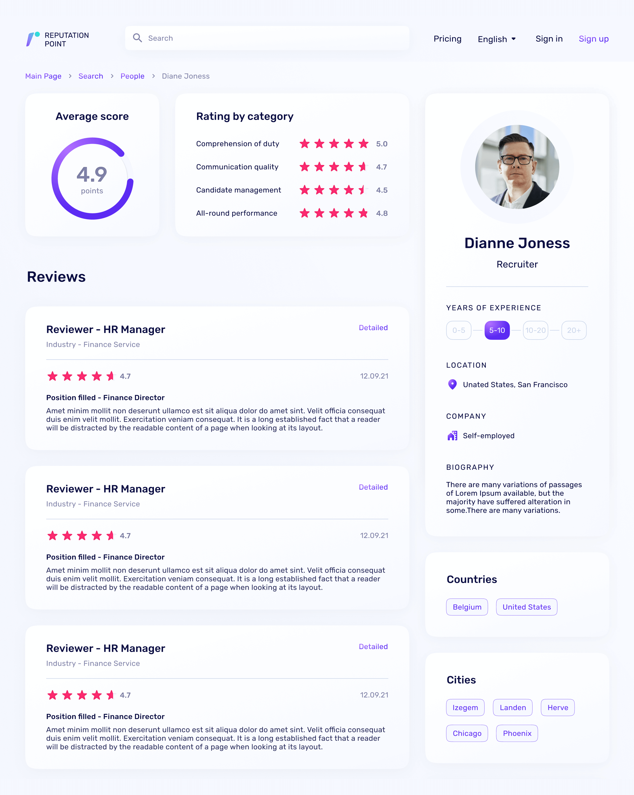
In order to continue following the principle of simplicity, we decided to make the interface as straightforward as possible.
For users to take less effort when interacting with the platform, we ensured that the number of actions per screen is kept to a minimum. It allows users to accomplish their primary goal faster and thus, grasp the value of the product.
The platform is designed using brand typography and colors, with navy blue and white gradient being the dominant colors and purple, green, and pink — the supplementary ones. We also created custom visuals and icons for the platform.
After the client had approved the designed prototypes, the project entered the development stage.
VALUE DELIVERED
Probably, one of the major outcomes we are proud of is that our relationship with the client evolved into a partnership, or even more so — friendship. We continue working together towards a shared goal — turning Reputation Point into a place that really makes the difference in the niche.
In addition, here are some other results we achieved:
Let's create something
awesomeOUR RECENT PROJECTS
 INCREASE APP ENGAGEMENT
- performance tracking app
- mobile-first development
- data entry automation
- software integration
