Do You Really Need That Button In Your Digital Product Design?
The answer would be ‘No’ unless that button serves a clear purpose. Every element in your digital product design is there for a reason, and if it’s not — it is just an unnecessary decoration, which should be eliminated.
Wait… Isn’t design about art? — Only to a certain extent.
What is digital product design about?
The primary goal of a design is to understand what end users need and solve their pressing problems in the most straightforward way.
Let’s clarify by using an example.
During our discussion with Agata Ageieva, Product Designer at Relive, we’ve touched upon what the digital product design process is actually like.
At one point in her career, Agata was working for a streaming service for amateur and semi-professional football. They provided fans with an option to highlight important game moments like goals or penalties and then add them to a stream. However, nobody used that feature.
If you were a digital product designer, what would be a seemingly logical move to change that pattern? — Improving the product’s usability; it’s obvious. And the easiest way to do so would be by adding a visual focus on that feature — i.e. a button. Yet, it wouldn’t have given the expected result, because the problem was not so straightforward.
After a series of research and user testing, the product team got critical findings. Secondary league games were held in the autumn-spring season and therefore, the weather conditions were often bad. People didn’t take laptops with them as there was no cover on the stadiums — they just used a phone or a camera to film a match. With that in mind, the product team came up with an idea to create a highlighting app within the streaming app itself so that users had it all in one place. As a result, they increased the usage of highlights by 50-60%.
This short example describes the very essence of app design. Digital product designers are engineers in the first place. They see the interdependence of components within the system and build connections between them.
But if designing digital products is rather an engineering activity than a creative one, why not hire developers right away and save on ‘the beauty’ of a product?
The value of digital product design for business
Customers are demanding. It comes as no surprise because they are surrounded by tons of great products and services in their daily life. With the likes of Amazon, Uber, and Apple, people got used to designs that are both visually outstanding and usable. Customers have high expectations. And if you fail to deliver on those expectations, you’ll get kicked out of the game.
Just a small test to prove this point.
TEST 1
Go to Google Play or App Store and choose any category; say, Dating. There are thousands of apps available. How would you shortlist them in the first place? — Based on positive user reviews and the appealing app UI design. Whether you like it or not, great visuals are an effective tool for attracting potential customers. People tend to believe that good-looking products are more reliable and perform better. That’s psychology.
TEST 2
Let’s proceed with the next step. How would you decide on the winner app then? — Based on the matching functionality and ease of use. Digital product design won’t work without a comprehensive understanding of the users, what they need, and how they want to achieve it. In other words, users are looking for value and strive to get it in the simplest possible way.
The primary reason why we are doing business is to make money. And the most basic ways to increase the company’s revenue are by attracting more customers and driving their engagement thanks to the delivery of a certain value. Design ticks both boxes. Companies that excel at the design of digital products grow their revenues 2x when compared to their competitors who don’t. And that’s not us saying this; these are the findings of McKinsey, the world’s renowned management consulting firm.
Which is a good app design practice?
At this point, here’s the primary takeaway. Design is value-driven; it takes into account every interaction that end users may have with the product and merge them into a digital experience that is aesthetically pleasing and solves a real request customers have.
What’s the key to a good digital product design though? — Design thinking.
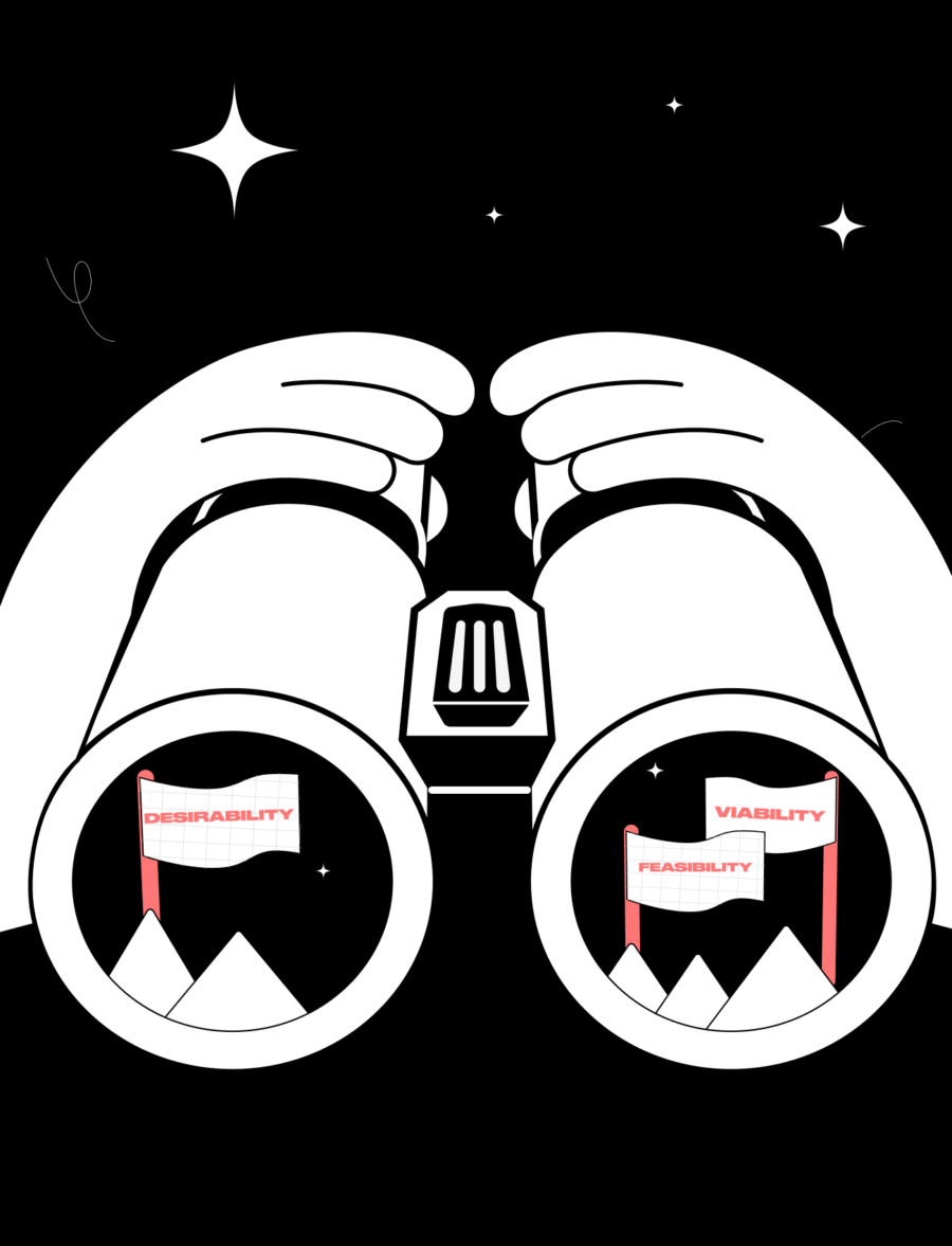
“Design thinking is a human-centered approach to innovation that draws from the designer’s toolkit to integrate the needs of people, the possibilities of technology, and the requirements for business success.”
Tim Brown, pioneer of the design thinking approach
Although design thinking is centered around the people for whom the product is created, the offered solution needs to be in sync with business goals and the tech capacity this business possesses. Otherwise, you risk designing a product that is not technologically feasible and economically viable.
Designers try to get to the root of the problem users face and think about new methods of solving it in the given context. Their intention is to improve the processes that already exist in the competitor products by introducing more straightforward ways of meeting user needs. Designers do not think in ready solutions. Instead, they come up with assumptions, or app design ideas, which are then prototyped and tested with users. It’s a dynamic iterative process, which persists until the most appropriate design solution is found. And once it is found, it gets into the cycle of validation and polishing. A product is considered good only when it is relevant (but that’s a different story).
Be like Elon — facilitate
Again, one example is worth thousands of words.
Everyone knows Elon Musk as the founder of Tesla and SpaceX. But few know that he participated in developing one more iconic brand — PayPal. In the early 2000s, Elon Musk created X.com, one of the first online banking sites, that further merged with PayPal.
The service was designed in a way that made it very easy to conduct payments, both P2P and B2C. To register, users were asked to fill in minimum personal information like name, phone, email address, etc. Upon that, they were allowed to make direct electronic fund transfers, credit card transfers, and pay bills in a couple of clicks.
This was a response to a traditional red-tape-driven banking system. Although Elon Musk is not a designer, he is certainly no stranger to the design thinking approach. And he knows exactly what the essence of a good design is. It’s all about facilitation.
At the time, PayPal revolutionized the approach to design. It made the design ‘invisible’ — no endless fields and blocks, just the ‘pay’ button. Now, it has become a new normal in the niche. Google Pay and Apple Pay can prove this.
How to measure digital product design?
We’ve mentioned some of the major characteristics of design, which are the ability to solve problems, facilitate processes, and bring value. Yet, connecting the dots between design and its actual impact on business success seems like a mission impossible.
Say, you operate a taxi business. Recently, you’ve started noticing a drop in the number of bookings via the app. Could it be that a few updates to the mobile app design change this? And how to measure that change?
✔️ Clarify your business objectives. If you do not know what determines the success of the redesign initiative, you won’t be able to measure the results. In the case of a taxi business, the goal is to increase retention.
✔️ Know your users. Before making any changes, you need to have a solid understanding of who you are designing for — i.e. demographics, behaviors, and needs.
✔️ Conduct a UX review. It’s a comprehensive process that often requires external help. A UX reviewer assesses the current user flow and detects the stumbling blocks preventing the user from taking the desired action.
✔️ Define the right metrics. Contrary to the popular belief, there are lots of quantitative and qualitative metrics pointing to the design impact. Net promoter score, product usability index, key experience indicators, customer effort score, etc. — they just need to be relevant to the product and user context.
✔️ Measure before measuring. To calculate the distance covered, you need to know where your point of departure was. That way, you can make the correct conclusions from the data and the reports you’ll obtain after design improvement.
✔️ Improve design. Find a design partner that will analyze the findings, compile the list of recommendations, and provide estimates. Once agreed upon, you can proceed with their implementation.
✔️ Measure the change. Now, you can get a clear picture of whether the product redesign has impacted user patterns and actions, and whether there’s still room for improvement.
At CXDojo, we offer a full range of UI/UX design services, including brand identity design, mobile and web app design, UX review, and more. Take a look at our case studies to better understand what you can expect from cooperation. If you think you are ready to take action, we’ll show you where it is needed most.
Author
back to all postsOUR RECENT PROJECTS
 INCREASE APP ENGAGEMENT
- performance tracking app
- mobile-first development
- data entry automation
- software integration


