5 POWERFUL WAYS TO IMPROVE USER ENGAGEMENT STRATEGY
Let’s be honest, as a brand, you expect a lot from your users. You want them to click, swipe, tap, fill, buy, etc. In other words, you want them to engage with your product. But before we dive into “how,” let’s first define “what.”
WHAT IS USER ENGAGEMENT?
User engagement refers to how people interact with your product. The competition in the market is high, and many SaaS products struggle to win the market share, acquire new customers, and keep existing customers happy and loyal. To achieve it, the product needs to be deeply engaged.
User engagement strategies have a significant impact on digital products as well. Nir Eyal, the author of the book Hooked – How to build habit-forming products, created the Hooked Model to show how successful platforms succeeded in making their product a part of our daily lives.
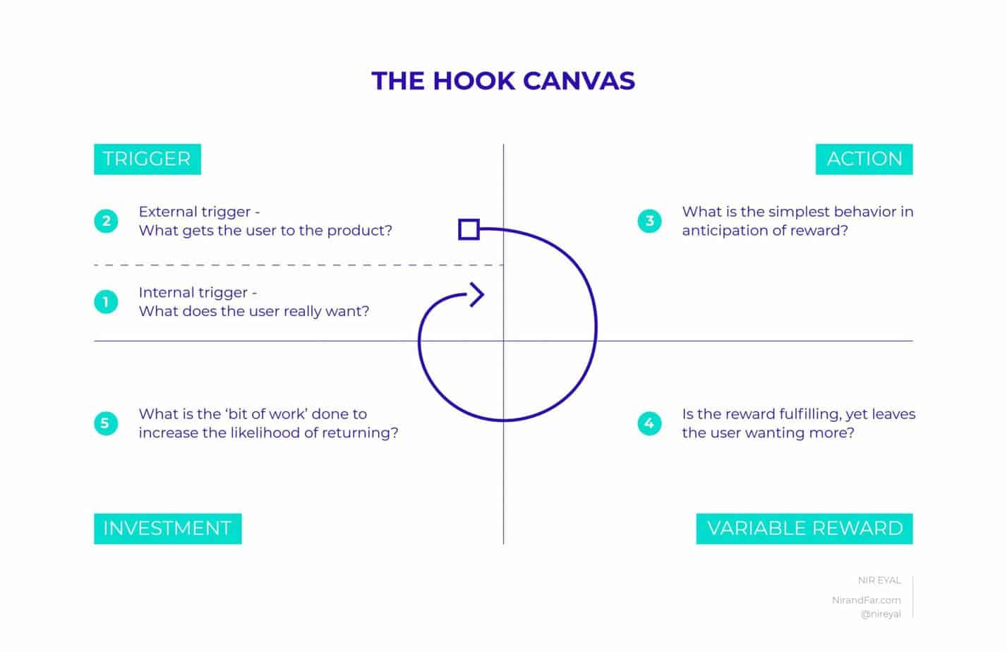
Users will only continue to use and pay for your product as long as they find it valuable.
The right product engagement strategies can increase the number of active users and reduced churn rates.
So how do you make people want to use your product, like it, and share it with others? This article won’t give a silver bullet that will make you the number one app in your niche and provide a constantly growing base of new users.
We cover in this blog post strategies that (if done correctly) will help you create an engaging product and make people love your product.
5 STRATEGIES TO ENHANCE USER ENGAGEMENT
These tips can help you distinguish your brand from competitors and improve user engagement. Let’s get into it!
MICROINTERACTIONS
A microinteraction is a single task-based interaction that you have with an interface. You experience dozens of them throughout the day: when you like someone’s post on Instagram, swipe photos, snooze the alarm on your phone, and so on.
Microinteractions are tiny animations and visual responses users see when they perform specific actions.
For instance, with the help of microinteraction, you can reward your users.
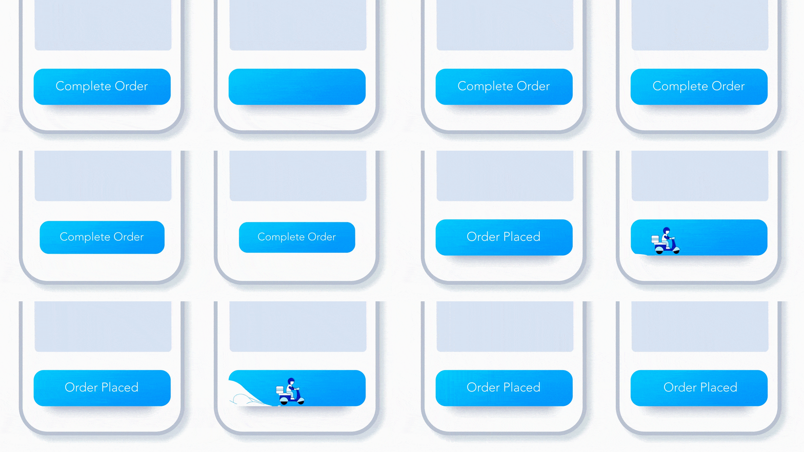
Like in the example above, when the user clicks “Complete Order,” a motorcyclist briefly appears before the app shows the success state – “Order Placed.” It makes users feel like they quickly ordered some goods. Users do appreciate such essential details.
Just to make it clear, microinteractions shouldn’t distract users from the main workflow. They are just here to increase engagement and give a little bit of extra delight.
Microinteractions enhance the UX and make the product easier to use.
According to Nielsen Norman Group, “one of the greatest joys of using technology comes through user empowerment and engagement. An enjoyable experience means more than just usability — it needs to be engaging, and that’s where microinteractions can play a macro role, by positively contributing to the look-and-feel of a product or service”.
Think about the most boring thing we all do on the Internet. I guess it’s downloading. You just have to wait, and wait, and wait… But waiting can be fun. Take a look.
Your product features bring users to your product. But details are what make them stay and eventually love your brand.
GAMIFICATION
Gamification is not about creating games and distracting users from the content. When used correctly, gamification increases product engagement, retention and makes the user experience more enjoyable.
According to Mordor Intelligence, the global gamification market was valued at USD 10.19 million in 2020 and is expected to reach USD 38.42 million by 2026 and grow at a CAGR of 25.10% over the forecast period (2021 – 2026).
For our client, a lifestyle application that can help people track mood and find out what personal factors are associated with greater happiness, we applied gamification elements to feel more motivated to enter their data.
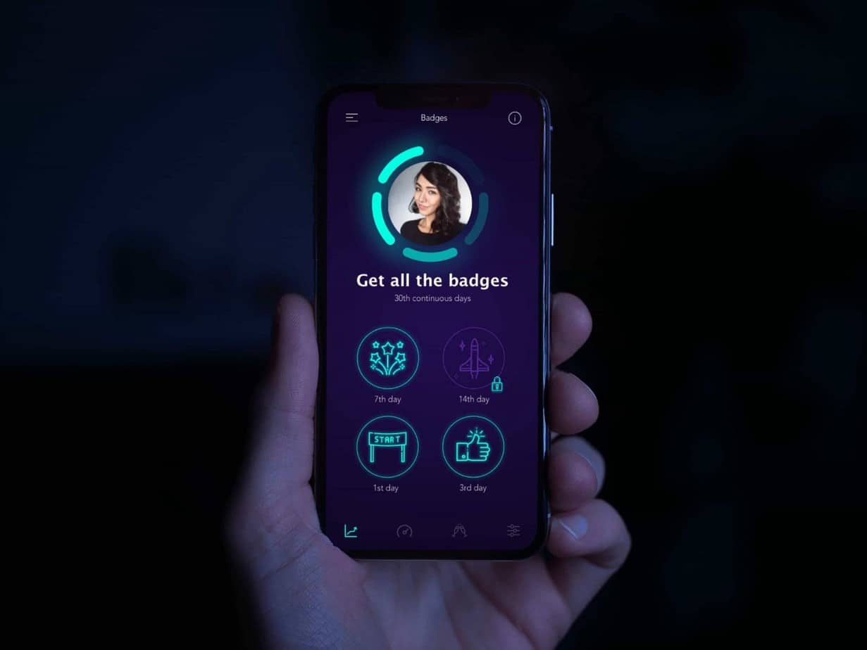
Users are awarded “motivational badges” on the 1st, 3rd, 7th, 14th, and 30th successive days of adding the information into the app regarding their mental state and factors that make them feel happy.
Thus, the user understood that it was necessary to fill in the data for several days in a row to receive the award.
Gamification is all about applying game-like mechanisms to non-game environments. It gives a sense of goal, progress, and motivation by achieving some points, winning badges.
For instance, Starbucks has been using a gamified rewards program for years.
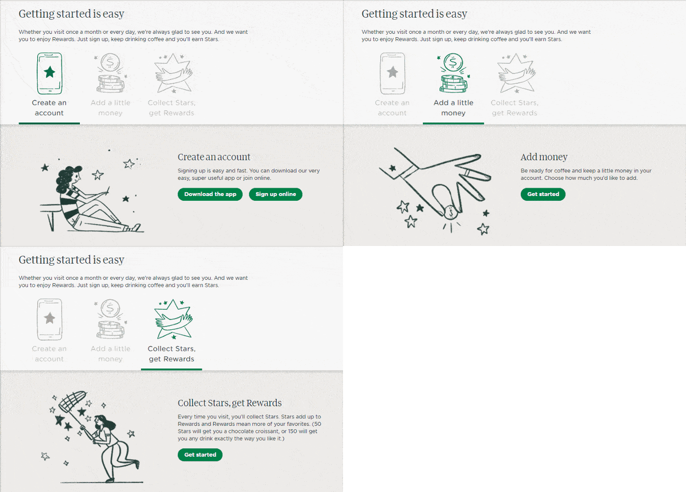
They leveraged the concept of gamification to improve Starbucks ’ experience and, in turn, drive sales as well. Customers register for “My Reward” using the app. Each time a customer interacted with the app, they gained some “stars” — representative of points in the Starbucks ecosystem.
MICROCOPY
When developing an app or a web platform, businesses usually focus on design and technology, seeking to make it impeccable. But quite often, when the users download the app, they abandon it after the first try, leaving business owners and developers confused. Despite that, the app can be technically perfect, and the business idea is one of a lot, the user engagement is low. Why? The answer is words. Words that are more powerful than an atom bomb. Those small words on users’ interfaces matter.
High-quality microcopy can’t be overlooked as a way to boost user engagement.
Microcopy is the small, informative text on forms, pop-ups, buttons, search prompts, tips, etc. They inform and assist people as they are using a product.
The microcopy used throughout your digital product strategy – form descriptions, CTA buttons, user onboarding – can explain technical details, encourage users toward completing a specific action and engage with them with your brand.
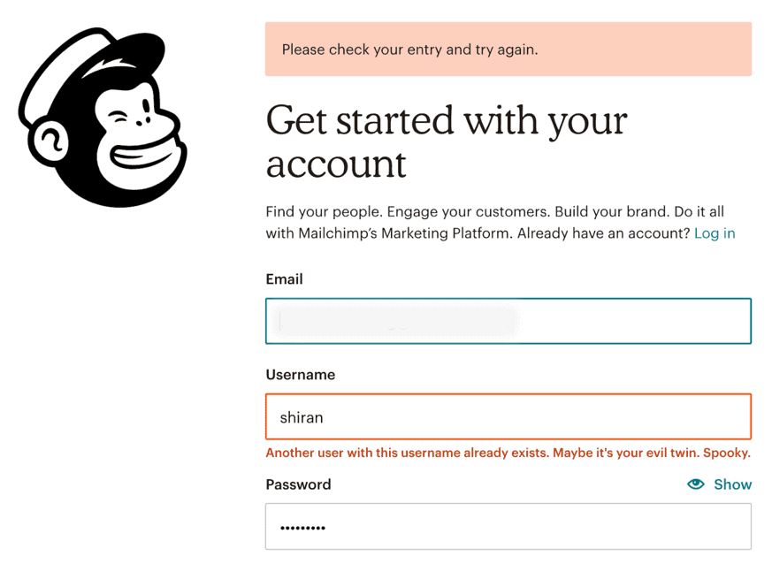
Let’s take a look at Mailchimp. Their friendly and personalized microcopy captures attention and makes it easy to enjoy their platform.
USER ONBOARDING
Don’t underestimate the user onboarding process. It has a powerful effect on the entire customer experience and journey. Onboarding is the first experience people have when they start using your product. Think of user onboarding as a hook to make users want to stay with your brand.
At this stage, your goal is to make them find the crucial value of your product as soon as possible and make it easier for them to interact with it.
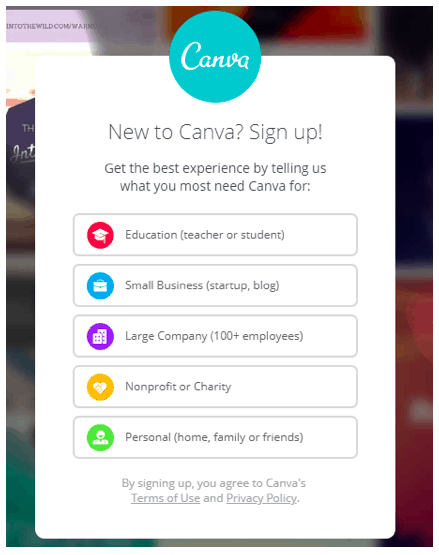
Once your users get into your app, make sure to greet them on the welcome screen. For example, Canva, a graphics design platform, asks its users what they want from the app. This information can be used to adapt what templates they show to each particular user from now on.
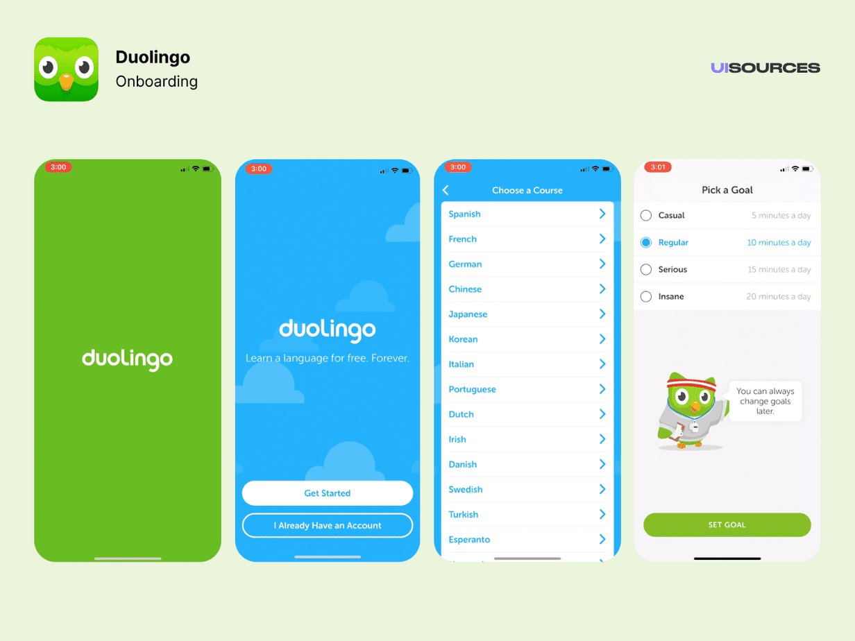
Duolingo, a language-learning app, has a user onboarding experience that begins gradual engagement. They postpone registration for as long as possible. First of all, they ask users to choose their learning goals. Then a progress bar helps set a student’s expectations of effort to complete a lesson. This is a great example of a value before registration approach. By allowing their users to engage with the app gradually, the current registration feels like a quick step.
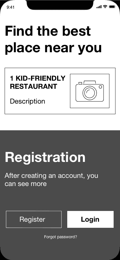
For our client, an app that helps find kid-friendly restaurants while traveling, we wanted to present the app’s benefits before asking users to register.
As part of our project, when a person downloads the app, they first get to try the app’s basic functionality. In our case, the application shows one kid-friendly restaurant in the neighborhood. Instead of forcing users to create a new account straight away, we let them try the app and see its value. Such an approach ensures that users get to know your app and what problem it will solve.
Engaging yet straightforward onboarding is your way of offering customers a warm welcome and the first step to making them want to return to your brand again and again.
MOBILE-FIRST DESIGN
By 2025, almost 73% of internet users will access the web via their smartphones. So if you’re not designing for mobile-first, you are in trouble.
Designing your digital products for mobile devices first helps you ensure that your users’ experience is seamless on any device. Here are a few tips for making your website mobile-friendly:
- Use a responsive design that adapts to all screen sizes.
- Choose fonts that are easily readable on a mobile screen.
- Compress file sizes and images so that your site can load quickly on mobile devices.
- Simplify navigation.
- Avoid pop-ups.
FYI, Google’s algorithm loves mobile-friendly websites:
“Getting good, relevant answers when you search shouldn’t depend on what device you’re using. You should get the best answer possible, whether you’re on a phone, desktop, or tablet. […] We started using mobile-friendliness as a ranking signal on mobile searches. […]”
That means by providing a good user experience on mobile, you increase your chances of higher rankings and conversions.
KEEP THE USER IN MIND
In the end, the most important thing to remember when is that you’re doing it for your user—and only your user.
Every improvement you make—whether you’re optimizing your onboarding or microcopy, there’s no sense in it if it doesn’t add value to your user experience.
If you’d like to know how to make your product more enjoyable, valuable, and make customers want to return to it again, let us know, and we will figure out how to make your user experience stand out from the crowd.
Author
back to all postsOUR RECENT PROJECTS
 INCREASE APP ENGAGEMENT
- performance tracking app
- mobile-first development
- data entry automation
- software integration


