UI/UX Design
PROJECT SUMMARY
CHALLENGE
Make a feature-intensive app intuitive for users of various tech backgrounds
PRODUCT
An automation tool for Android gaming apps
DELIVERABLES
Revised data hierarchy; complete app redesign; dark & light modes; ready-to-use UI kitCLIENT REVIEW
I don't think there's anything they can improve on — I got exactly what I needed, and they were a great partner. Their designers were great at understanding my needs and bringing in the right people to fill my needs — I’d love to work with them again.
OVERVIEW
The client runs a company that builds automation tools for Android apps. Their core business idea is to make automation easy for everyone, whatever the level of their tech expertise. The client’s new product focuses specifically on emulating games. It brings the mobile gameplay to Windows-powered desktops and facilitates certain in-game processes like resource farming, boss finding, killing monsters, etc. Overall, the app is a great helper for gamers as it improves character performance.
CHALLENGE
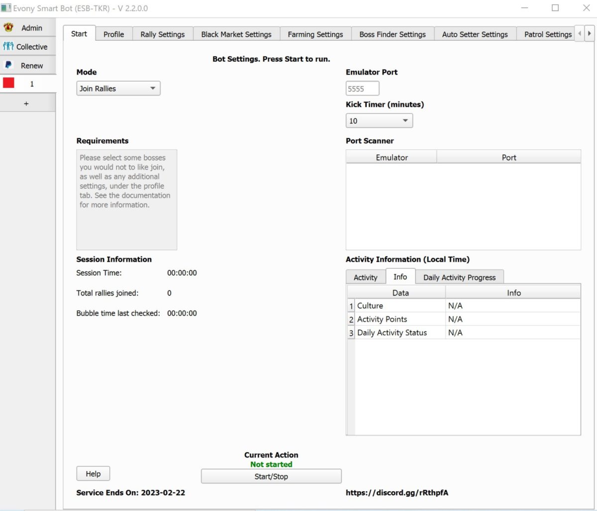
The client is also a software developer, so the coding part of an app had already been completed when he turned to CXDojo. Although the app was live with over 1000 gamers on board, it lacked UI/UX design as it is. It was akin to all those early table-based computer programs that had little to no visual accents.
The app is complex and as the client aptly puts it “a very setting-oriented one”. It allows for numerous phones to be added to the game simulator, meaning lots of parallel processes are run by the app. In order to change settings for any of the key in-game activities, the user had to switch between numerous tabs and adjust lots of parameters. For those who don’t have a tech-first mindset, it was difficult to grasp the data hierarchy and interdependencies. This could hardly contribute to the app’s appeal among a larger audience of gamers.
Our task was to make the app’s interface more understandable, while also preserving its functionality.
SOLUTION
As always, we started by conducting several workshops with the client. They are designed to bring the client and the expert team together for active discussion of the product, users, and goals that the client expects to achieve. Since everything we do is always about the client and the experience the user gets from interacting with their business, we aimed to get as much insight as possible.
Information hierarchy
The key issue that we were trying to solve is the complexity of the user interface due to the abundance of features. Once we got familiar with the app’s mechanics, it became clear that we need to first segregate the most-used features and bring them to the forefront so the user can have them all at hand. Driven by this principle, we introduced 2 core levels of features: primary — for supported games, connected phone emulators, game character profiles and activities they perform, whereas secondary — for additions like the general user profile, payment info, and community interactions.
Primary level
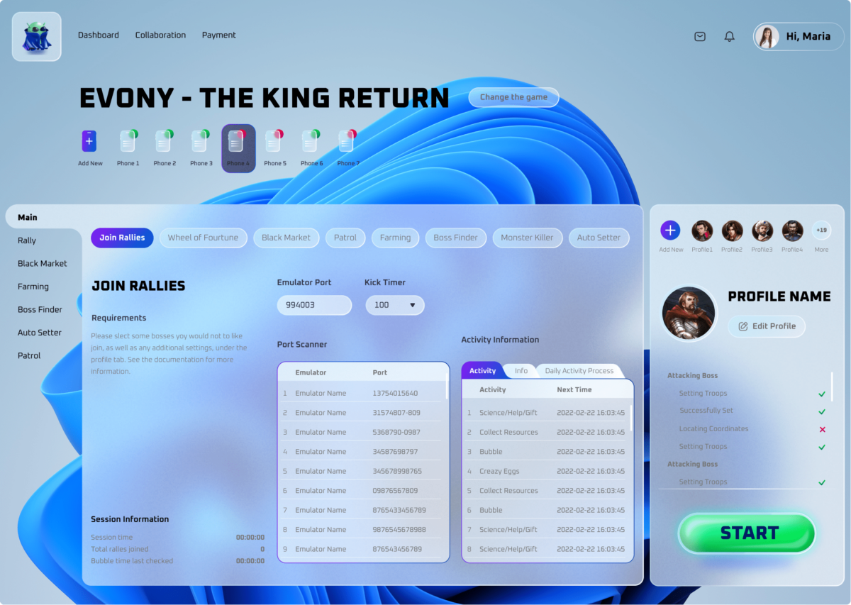
The primary features took center stage and had several key layers — for game selection, management of connected devices, character profiles, and in-game activities.
Since the character’s settings affect all activities it performs, it was logical to combine the character profile tab with the activity tabs for the user to adjust interrelated parameters side-by-side without constantly switching between the tabs.
To further simplify the process, we created the main tab that serves as a single point of control for all character activities. There, the user can multi-select the things they’d like their character to do in the game, set up general properties, monitor the progress, and set timers for the game session.
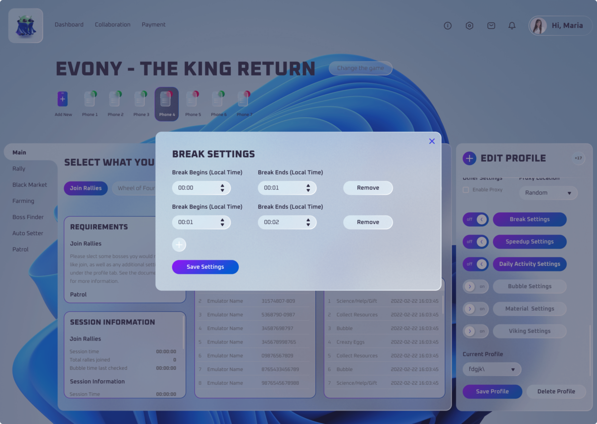
On the other hand, custom specifications for each character activity are available to the user in a dedicated tab through pop-up settings.
Also, when working on the project, we identified the necessity for adding an extra primary feature — game selection. The original app catered to the automation of one single game, Evony — The King’s Return. But the client had plans for expanding the app’s functionality to cover the automation needs of other games as well.
Secondary level
We placed secondary features where users expect to see them since most apps locate them that way. Of course, UI/UX should be unique for each product and match its specific goals. But in design, we also take into account the user’s mental models. Based on their previous interactions with a multitude of apps and websites, people get used to the way certain elements of the user interface look and feel. They expect the same experience from using those elements in all digital products — otherwise, it will cause user resentment and consequently, churn.
Thus, in the top right corner, we placed the profile tap, where users can customize their settings like personal info, language, push notifications, etc. While the top left corner was dedicated 1) to the payment tab, where the user can renew their subscription, and 2) to the collaboration tab for social interactions with the gamer community.
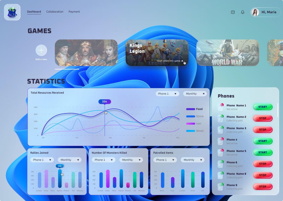
We also added the dashboard that depicts the stats across all characters and games. That way, the user can monitor their overall activity without the necessity to collect that data from each character profile.
Visual design
To make visuals brand-coherent in color, typography, and style, we first worked on the brand identity design for the client. Thus, when we proceeded with the platform’s design, we already had an idea of what impression it should have on users. We opted for glassmorphism because of its translucent effect that adds depth to the multi-layered interface and makes it easier to accentuate certain elements.
But the aesthetic appeal is not the only purpose a well-thought-out visual design serves. It helps improve the usability of the product too. With it, you can manipulate the user’s attention and motivate them to perform the required action.
In order to exploit the design’s strategic potential, we created the list of target actions that the user is expected to perform and arranged visual elements accordingly. For instance, the start/stop button stands out from other design elements on purpose. And it’s not just about the color; it also has a larger font size and a 3D style. This leads the user’s eye straight to the button, which is a good thing because it is the most important interface element — it activates the overall automation functionality. The early version of the app also had that button but it took quite a while for the user to spot it among other same-style interface elements.
Along with this, we wanted to create a design that would be communicating the app’s essence. This is why we made the interface similar to that of computer games and included the Android iconic bot in the app’s logo.
What’s more, the abstract background image is Windows-native, which implies that the app is compatible with this particular OS. Yet, it can be adjusted once the client decides on covering other operating systems too.
VALUE DELIVERED
Let's create something
awesomeOUR RECENT PROJECTS
 Custom Logo Design For An Android App Emulator
- gaming app emulator
- logo concept & design
- brand identity
- brand book

 INCREASE APP ENGAGEMENT
- performance tracking app
- mobile-first development
- data entry automation
- software integration