An In-Depth Guide to Website Revamp [Designer Pro Tips Included]
Every business needs a website.
In 2022, it is a must even if you run a local company and target the audience from a single country or city. It is a proven fact that 99% of customers go online to find information about local businesses and 78% of them do it more than once a week.
A website is the digital representation of your business — its face and its differentiator. So you can’t do without it nowadays. What’s more, you can’t afford your website to be laggy, unoptimized for seamless use, and simply unappealing to potential customers.
Businesses that don’t have a website yet should definitely think about creating one if they want to attract more clients and generate more revenue. It’s clear. But what about those who already have an online presence and even see customers coming to their site?
It won’t last forever.
Websites that were built 10 years ago are not the same as those being built today in terms of functionality, customer experience, and technologies powering them. Likewise, modern-day websites will be obsolete and ineffective 10 years from now. Just having a website is not enough. You need to regularly upgrade your site the same way you do with your car in order to keep it running and fulfilling its task.
This is when you start thinking of website redesign.
What is a website redesign? [Definition]

Let’s refer to Cambridge Dictionary. It defines Redesign as “the process of changing the way something looks, is made, or works.” Thus, when we talk about redesigning a website, we mean rebuilding its structure, interface, and functionality.
Huh! How is this different from designing a website from scratch then?
It’s not, in terms of both the process and effort required. Yet, the need for website redesign always arises in response to a burning issue that the existing website can no longer solve. And this exact issue affects which approach to redesign the team should take. It means a website revamp is a flexible process. There are 3 redesign approaches:
- Website makeover. This one is akin to designing from scratch as it involves complete website restructuring and brand identity alteration. Such a redesign is complex and costly — but is not always necessary. It makes sense when your business goals have changed dramatically and as a result, you are entering the market with a new product, or targeting an absolutely different segment of users. Another example is reputational damage. Let’s assume your company has been involved in a high-profile scandal. As you are now pivoting, you don’t want your new products to be associated with a tainted brand, so you opt for a complete brand and website redesign.
- Website modernization. This approach works for websites that generally function as expected, yet have some bottlenecks that need to be removed. For example, your website analytics show that new users don’t stay long and drop off at the registration stage. In this case, the design team won’t be ruining everything that you have been building for so long. They will just improve the original website by incorporating new design solutions that solve this specific problem. Also, modernization is used for websites that require updates to function more effectively. Let’s say you have decided to extend your website’s capabilities and functionality as a result of the increased range of products or services you offer. It’s now not enough to just add new items to the product page. The original page will likely need redesigning in order to feature categories, filters, and many more.
- Iterative redesign. This is what we often apply in our work — be it design, development, or digital transformation of your business. It is based on a gradual update of your website by means of short design experiments. The iterative redesign is best for multi-featured websites at the scaling stage
- For instance, you are running a large e-commerce store with stable revenue. Your current business goal is to diversify the existing customer base by attracting a younger audience. You can’t afford to redesign a website in one go as you risk losing a solid number of loyal customers who are used to how your site looks and functions. Based on user research and analytics, the team implements small design changes that are then tested with real users to validate whether they work well or not. Thus, after a number of iterations, you get a revamped website that attracts new customers and retains the existing ones.
- One more example is when you need a complete redesign due to pivoting or any other massive change, but you can’t afford to wait until the last website element is redesigned. So the revamp is performed iteration by iteration — first, one set of functionality, then another, and so on. This allows you to keep your business running, while also earning a profit on newly released sets of features. This translates into getting a faster return on redesign investment.
Your website is designed to complete a certain task. Namely, it helps a customer find your business and travel all the way from the first visit to awareness to conversion to come-back. Ideally, a redesign should be initiated if there’s a need for facilitating this journey at any of the points and making the customer complete their target action faster.
This naturally brings us to the following question.
How do you know you need a website revamp?
A website redesign is rarely at the top of the list of the company’s strategic priorities. Nevertheless, there are cases where it is a matter of necessity and your task is to timely spot it.
Let’s take a look at common reasons that steer businesses toward revamping and examine whether each of them is reason enough for a massive website redesigning initiative, or whether you can fix it without exerting great effort.
Why redesign a website? Common reasons

As mentioned above, some companies decide to redesign a website as part of a rebranding strategy. Others want to keep up with the times and expectations of modern customers and thus, alter the existing website by improving usability and extending functionality. Yet, even if two companies have the same reason for a revamp, the website redesign strategy will likely be different for each because it is shaped by individual factors such as a site’s size, domain, budget, goals, tech powering it, etc. And sometimes, it’s not redesigning that may solve the problem more effectively.
Reason #1: “My site has an outdated design”
This is indeed a common reason for revamping a website. Yet, every time we hear it from our customers, we keep asking them the following questions:
- Who says it? You? Or your clients?
- Does it affect your website’s performance? Conversion?
- Does your website bring revenue?
The problem with ‘outdated design’ is that it is often dictated by a personal preference and not the real necessity for a redesign. Sure, you can re-color your website’s interface and re-fresh it with modern-looking graphics, but what exactly will it bring you in tangible terms? If you can’t answer this question, think again.
Here’s a simple example. You own a small coffee house where you get your profit from offline sales. The reason for running a website is basically awareness. It helps clients find your cafe faster, check its interior, and contact you to book a table. That’s it — all target interactions take place offline. If this is the case, a site revamp will hardly become a value-enhancing investment. However, if your site is equipped with ordering and delivery features, then it makes sense to re-examine user flows and facilitate the client’s path to action where possible.
Reason #2: “My site is difficult to use”
In most cases, this is reason enough to get the process for website redesign going.
Unfortunately, many companies do not pay extra attention to user experience on their sites — whereas, this largely determines whether their website visitors convert into customers or not.
The market is continuously evolving, giving birth to new more innovative products. This, in turn, changes user behavior and expectations. Modern customers are spoiled by a wide choice of solutions and naturally, go with those providing them with the desired result in an easy and fast way. They attribute value to user-friendly websites that offer simple functionality and easy learning of how to interact with them. It means the faster the user can get from the first point of contact to their goal, the higher their trust level and satisfaction rate will be.
Your loyal customers will likely turn the blind eye to your website’s shortcomings, but the new and most importantly, young audience won’t tolerate poor user experience. Keep this in mind.
Reason #3: “My site has no traffic & no conversions”
The root cause here may not necessarily be poor design.
First, make sure that your website is optimized for search engines and thus, has enough visibility online. The SEO audit should include testing for core web vitals like page speed and user interaction measurements, as well as for the quality of content on your website — it may simply target the wrong audience and deliver the wrong message.
Secondly, don’t dismiss the possibility of human factor. If along with the site, you rely heavily on the sales team in pitching your products to the customer, chances are they have a part in decreased conversions. Re-consider your sales strategy and the approach you take to talk potential customers into buying.
Reason #4: “My site is not compatible with all devices”
The era of desktop-only sites has long ended. Modern customers are more connected and mobile-dependent. This is proven by Statista: “In the second quarter of 2022, mobile devices generated 58.99% of global website traffic.” Just imagine what piece of the pie you are stinted of!
Being responsive is a must for any site. Even Google prioritizes mobile search over desktop search nowadays and ranks high only those sites that tick all the boxes of mobile-friendliness. That’s because users expect a seamless experience across all devices. If your website is unable to provide it, they will leave it after a few seconds of using. To eliminate this risk you need a website redesign.
Reason #5: “My site is full of bugs and errors”
You may have an awesome-looking website with cool products. But if it doesn’t function as expected, while also spitting out errors all along the user’s journey, you may pay a heavy price for it — your business. 88% of people will not return to a site with a bad user experience. It’s an unwritten rule that the site must perform well and help users find what they need easily.
Certainly, this is an important issue that must be solved as soon as possible. But since we talk about bugs and errors, it doesn’t always imply that poor design is to blame. Another possible culprit is messy code that is hard to manage. An effective remedy for this is refactoring.
If, however, it’s not for code, then it’s likely UX bugs that need to be fixed by means of revamping a website.
To sum things up, it is no fresh news that the decision for a website overhaul must be based on facts and figures, not assumptions. And so far the above reasons are just assumptions. For them to be viable, they should be data-backed. That’s the only way to make valid improvements. So always do your homework before sinking your money into a redesign initiative.
What to necessarily include in a redesign strategy?

— Website redesign goals and measurable outcomes.
- Goals — i.e. the whys behind website redesign. You must never be guided by intuition when considering a redesign — we’ve mentioned it already. Instead, you must have a good motive for such a decision. What do you want to achieve by having your website revamped? Motives like ‘getting a modern-looking interface’ or ‘keeping up with competitors’ are not good enough unless they affect your business performance or customer satisfaction. In other words, your goals are basically a critical mission behind a redesign initiative, and this mission is always data-driven.
- Measurable outcomes — i.e. redesign success metrics. How do you know you have met website redesign objectives? If there are no metrics that can prove it, you won’t be able to understand whether you are getting where you aimed to get. To make goals possible to achieve, you must define measurable results — something that can quantify the after-redesign progress. Well-defined specific outcomes are essential for making design efforts meaningful, for both your business and your customers. But to ensure they are impactful, you need to also have access to pre-redesign performance benchmarks for side-by-side comparison.
Now that you have completed the preparatory phase, it’s time to kick off the long-awaited website redesign process.
Website redesign process: Steps & Tips
Over the course of its operation, CXDojo has been working on many custom website redesign projects — all driven by different goals. Yet still, the redesign steps have always been the same (with slight variations). This process has been distilled from almost 10 years of experience in web design. And today, we’d like to share it with you.

Step 1. Identifying a problem
We always start by interviewing a client. This is to learn where the existing website underperforms and articulate which issues and barriers we need to overcome. If there’s no problem, there’s no reason for initiating a website revamp process.
Step 2. Analyzing data
Although we’ve already collected information on the problem, it comes from a highly-subjective source — client briefing — that requires validation. So at this stage, we try to understand whether the alleged problem is real. We tap into data analytics and measure parameters we are particularly interested in to know where to focus our design efforts.
Step 3. Defining project scope
We create a project scope to not only document the task pool, but also determine the redesign goals, deliverables, and milestones, which are then negotiated with the client. The project scope is used for planning a website redesign in a holistic high-level manner.
Step 4. Examining user flow
We validate the many different paths the user currently takes from the entry point to the completed target action. It is essential to map out each and every step, otherwise, you risk overlooking critical flaws the user encounters when interacting with your website’s design or functionality. We then improve those user flows to eliminate the existing bottlenecks.
Step 5. Outlining website structure
Well-thought-out user flows help us understand how many pages the website needs to have, what those pages should be, and how they are linked with each other. On that basis, we document the website’s structure and agree on it with the client.
Step 6. Making estimates
By this stage, we already have a clear view of the resources required for making changes to the website, including person-hours, budget, and timeline. Accurate estimates and an action plan ensure that the redesign project won’t take the wrong turn, resulting in unexpected project setbacks.
Step 7. Wireframing
Here we can go two ways. The first way is creating skeletons for all pages at once and then, validating them through usability tests. Mind, however, that it may take a solid time.
Alternatively, we can start by wireframing and testing the key pages first. And while they are being implemented in the website, the design team continues working on the remaining — less critical — pages, one by one. This approach makes sense when there’s a pressing need for certain changes to the website design, which, if not applied timely, may dent user experience.
Step 8. Designing
It refers to the visual part of a website redesign — i.e. styling, color, and graphics. If there’s no request for rebranding, we stick to the existing brand guidelines. Yet, we try to use the identity elements in a way that would re-energize the aesthetics of the site.
Website redesign example: Before vs After
A picture’s worth a thousand words. We can talk about the importance of a website revamp endlessly, but for those, who are not into professional design, it may sound less obvious.
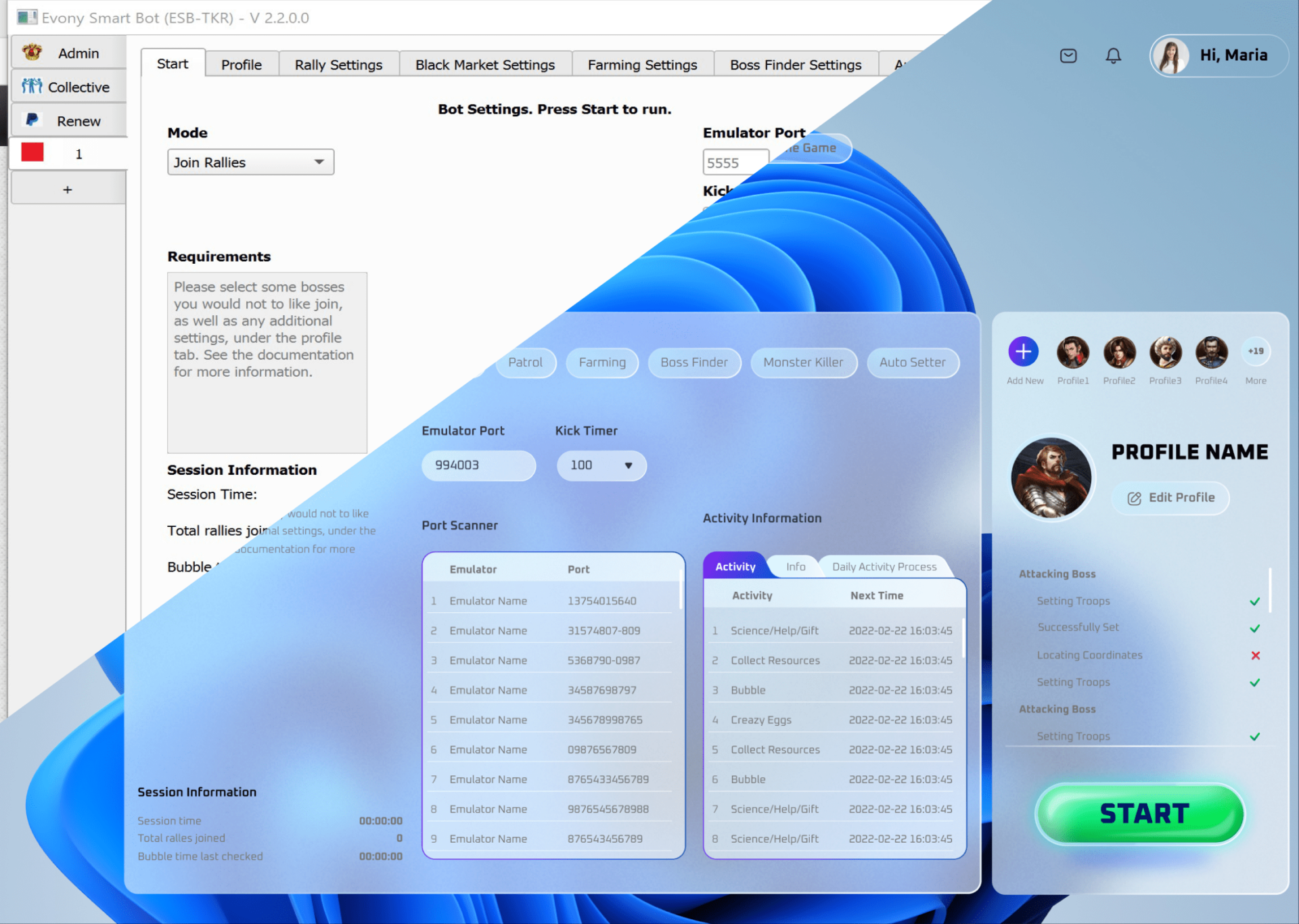
Here’s a real example from our portfolio, where you can see what the interface looked like before and after the redesign.

The trickiest part of this redesign project was to solve the complexity of the user interface by building a clear data hierarchy. We introduced 2 core levels of features, bringing the most used ones to the forefront so they are all at hand. Also, in order to exploit the design’s strategic potential, we created the list of target actions that the user is expected to perform and arranged visual elements accordingly.
Earlier, this product attracted only hard-core gamers, who were not repelled by the interface complexity. Now, it is intuitive even for newbies, which has naturally resulted in an increased user base.
As you can see, a site redesign is a tool that helps your business achieve very specific goals. So there is no point in embarking on such an undertaking if you don’t have a clear vision of what problem it solves and what contribution it may ultimately make.
Wondering whether a redesign is a right way to fix your current website issues? Let us take a look.
Author
back to all postsOUR RECENT PROJECTS
 Enhancing Platform Usability with UI/UX Design
- gaming app emulator
- usability improvement
- data hierarchy
- visual design


