TIPS ON USER EXPERIENCE AND USABILITY, OR HOW TO MAKE CUSTOMERS LOVE YOUR PRODUCT
“A great product isn’t just a collection of features. It’s how it all works together.”
Tim Cook, CEO of Apple Inc.
Obviously, Tim Cook knows a thing or two about creating products that millions of people truly love. There are lots of tech companies that develop products with the same functionality. But they are nowhere near as successful as those created by Apple. If a user tries an i-product once, they are unlikely to switch to its alternative. So, what’s the phenomenon of Apple products?
Apple has mastered the art of user experience design to perfection. Its products not only appeal to the eye, but it is also a pleasure to use them. When you start a Mac or an iPhone for the first time, you will notice how surprisingly easy it is to get to grips with the interface. There’s no clutter and every functional element communicates its clear purpose. Brand aesthetics, interaction patterns, and flows are consistent across all products. But there’s more. Apple’s major focus is on emotional engagement with customers. It is striving to be associated with creativity and innovation — hence, its early slogan “Think different”. And as we can see, it really works.
The key factor that affects your digital product’s success is user experience and usability. The more effort you invest in UX design, the higher the chances of releasing a new hit to the market.
USABILITY VS USER EXPERIENCE: WHAT’S THE DIFFERENCE?
It’s tough to tell the difference between the two because usability is an essential part of the product’s user experience. Usability is a measure of how straightforward it is to interact with a digital product. The main usability principles include 1) accessibility, 2) clarity, 3) error tolerance, and 4) efficiency. Basically, product usability defines whether or not it is easy for a user to achieve their goals.
On the other hand, user experience (UX) is an umbrella term. It encompasses the product’s utility, functionality, usability, and aesthetic appeal. UX defines how customers perceive a digital product, and what they feel when interacting with it.
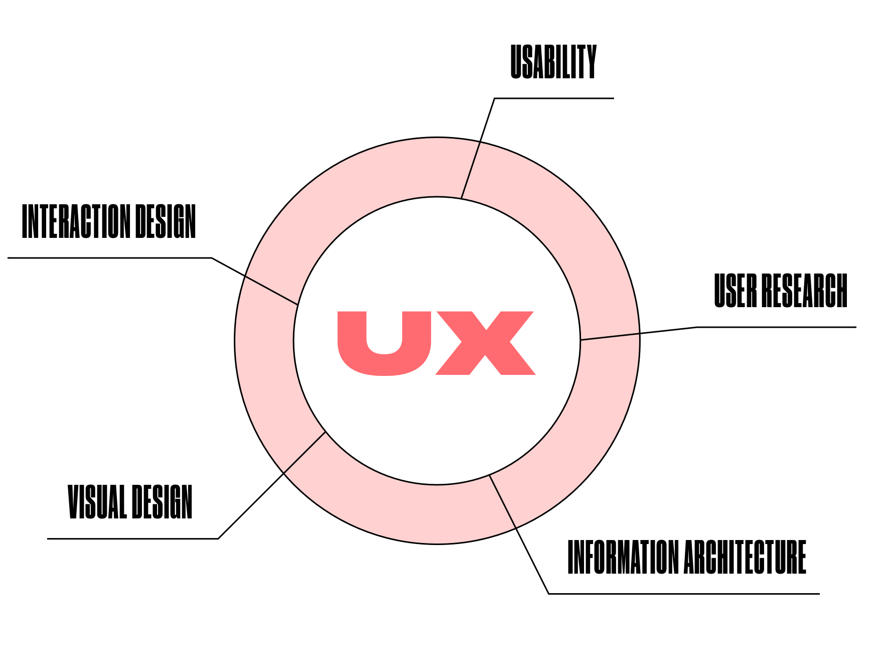
There’s also a user experience vs customer experience battle. People often use the two terms interchangeably. But it’s not accurate. Just like in the case of usability, it’s all about hierarchy. UX is a constituent part of CX that reflects the experience of customers with a particular product. CX, in turn, reflects customer sentiments towards the brand in general.
WHY DIGITAL PRODUCT DESIGN MATTERS
Good UX design is user-centric. It is based on user needs and expectations. Customers turn to your product because they believe it can solve their problems — fast and with little effort on their part. Let’s consider an example.
Most likely, everyone is familiar with Booking.com in the context of trip planning. Customers use this platform to find accommodation that fits their preferences and, of course, pocket. Booking.com has a killer feature — Map View. A profile page of every hotel has a map. It shows nearby offerings with price tags and brief profiles. This is a great way to compare all accommodations within the desired location against each other and pick the most appropriate one. It literally takes you a couple of clicks to achieve the end goal.
That’s a merit of a well-thought-out user experience design. In a few simple steps, it brings users where they want to be. This results in increased app engagement and customer satisfaction.
THE ROLE OF COLLABORATION IN DESIGNING DIGITAL PRODUCTS
It’s not rocket science to design user experience if one possesses relevant knowledge. But it really is challenging to do so alone. One needs to wear a lot of hats to make the design work as expected.
Effective design is delivered collaboratively. It is a multifaceted complex process that requires diverse expertise. That way, a user experience designer looks at the product from different perspectives and finds better design solutions that suit the needs of both the user and the client.
A dream team should consist of the client, user, designer, developer, and copywriter.

CLIENT
As a rule, digital products design starts with an abstract idea. Involving the client in the design process is a must for delivering a product that is consistent with the brand vision, style, and goals. By maintaining regular communication with team members, the client can ensure that the digital product is designed in line with specifications.
USER
To make the design user-friendly, it is necessary to step into the customer’s shoes and work out all possible use cases, flows, scenarios, etc. This is impossible without collaboration with end users. The user-centered design process provides for the participation of potential customers in defining requirements for a digital product. This is done through interviews, surveys, and usability tests.
DESIGNER
A UX designer acts as the key player. When setting the UX design process, they should know how to satisfy user needs in the context of business objectives. With a clear understanding of the product’s strategy and the ultimate impression targeted, a designer chooses the right approach to user experience and usability.
DEVELOPER
Design is not only colors and images. It is a basis for the product’s structure and functionality. Working in sync with a developer makes it possible to create a design that is implementable. Both a designer and a developer should know what they are building, why, and how. This is the only way to develop a product that is viable.
COPYWRITER
Few talk about the role of a copywriter in the UX design process. In fact, this role is essential. They not only guide users with text; they communicate the brand voice. The UX copy must be clear, concise, and helpful to end users. It speaks the language that customers understand, which creates a bond between the user and the product.
We, at CXDojo, take collaboration with clients seriously. CXDojo has been providing product design & development services for 7 years. At one point, we realized that collaboration is the most effective way to deliver the product that was originally envisioned.
A LEAN DESIGN APPROACH TO USER EXPERIENCE AND USABILITY
Who wants to invest in a product that no customer will ultimately use? The answer is self-evident — no one.
The lean UX design process is organized iteratively. It consists of several stages that are repeated until the final product design is ready. This helps to foresee all user experience and usability nuances because every design idea is validated and tested with users.
USER EXPERIENCE DESIGN PROCESS IN STEPS
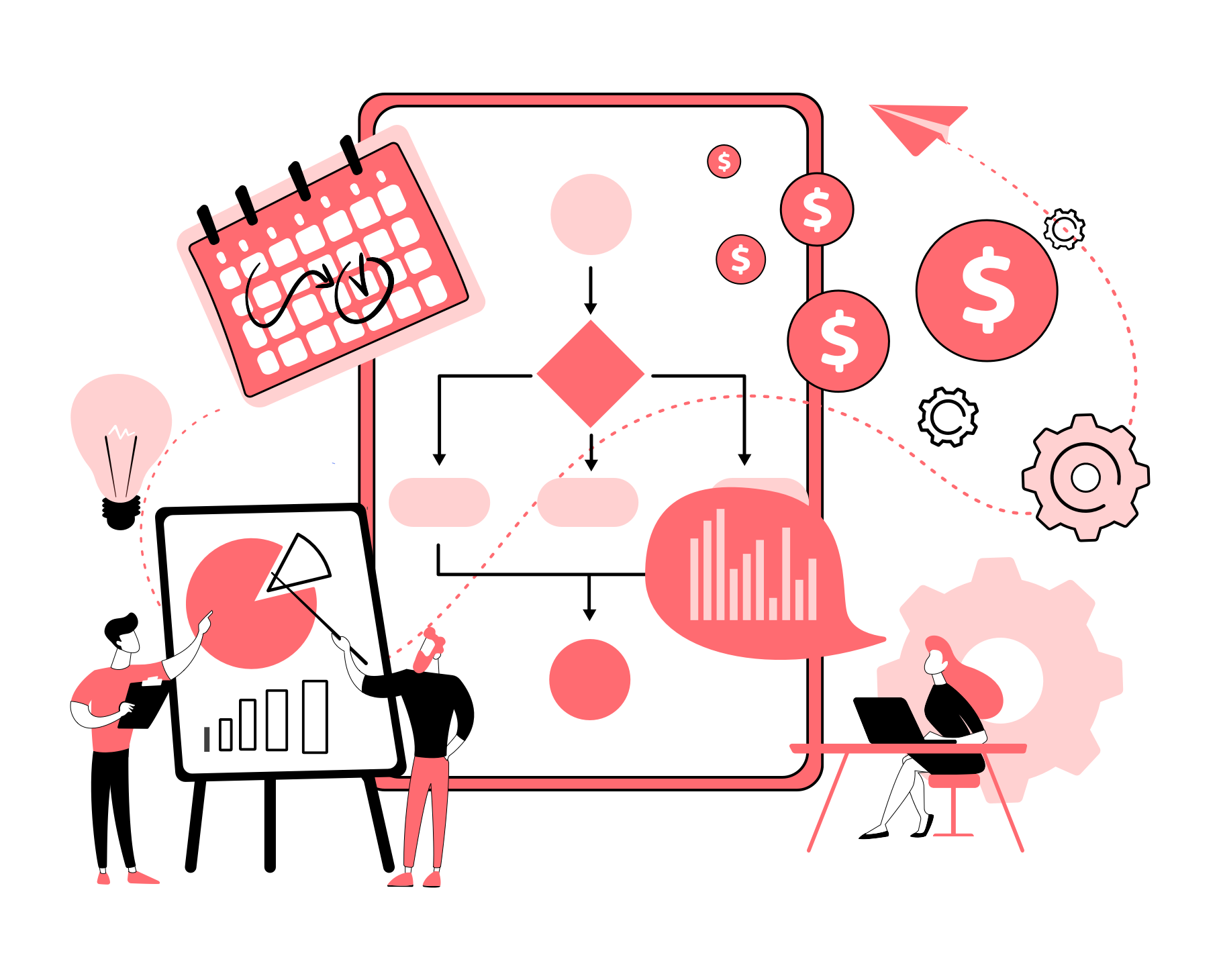
The agile UX design process derives from the lean startup methodology put forward by Eric Ries in 2011. The feedback loop is the basis of this methodology. By analyzing the response of potential users to product ideas or improvements, it is possible to create something of great value.
There are 3 steps in the lean design process — think, make, and check. But each step has sub-steps.
DO RESEARCH
Before the actual design process begins, it is crucial to perform research. And it’s not only market research. The team should also gather information about the business owner’s vision of the product. This includes the product’s purpose, value proposition, and metrics of success.
Once the general concept of the product is clear, it’s time to learn who the potential users are. One of the best UX practices is to keep the user at the heart of the product design. So, every UX decision should be made from the user’s perspective. This results in a higher chance of the customer using your digital product again and again. User research can either make or break your product. The inaccurately defined target audience may cause its immediate failure or force you to pivot.
HOW?
For product research: meetings with business owners, workshops.
For competitor research: heuristic analysis, comparison charts, SWOT analysis.
For user research: interviews, surveys, focus groups, user personas, use cases.
GENERATE IDEAS
Here comes the ideation stage. The aim is to define user problems and decide how the digital product design will solve them.
At this stage, collaboration is of prime importance too. Groundbreaking ideas may come from anyone. But it’s critical that all team members are on the same page and are familiar with research findings. Otherwise, you risk ending up with a product that is irrelevant to neither user needs nor business goals.
From there, it’s time to think about possible layouts and features that may provide the desired user experience and usability.
HOW?
- Brainstorming sessions
- Workshops
- Storyboards
- Mood boards
- Sketches
DESIGN

Traditionally, the actual UI/UX design process consists of 3 phases — wireframing, prototyping, and the final design. But the process can be customized according to the project’s budget, scope, timeframe, and specific goals.
Phase 1. A user experience designer starts by creating wireframes to visualize the layout of the product and the paths users take to achieve their goals. Basically, it is a map that reflects the overall user experience, end product functionality, navigation elements, and interactions — without visuals.
Phase 2. Once the wireframes are ready, the team can proceed to designing interactive prototypes. A prototype acts as an MVP (minimum viable product). It helps collect feedback from both users and stakeholders, and understand whether the team is on the right track.
Phase 3. Finally, the team moves on to the large-scale user experience and usability design. At this stage, they deal with visual consistency, branding, micro-interactions, screen transitions, and accessibility improvements. Also, a designer works out design specifications that they later hand over to developers.
TEST & MEASURE
We recommend conducting tests at every stage of the user experience design — i.e. concept, prototype, final design, and ready product. Obviously, it is easier and less costly to fix the problem at the early stage, than dive into redesigning after the product’s release.
It is not uncommon when something works as expected in the wireframe, but once the final design goes live, things change. The problem may lie in anything from the inappropriate color of a CTA button to information architecture.
Mind also that some post-release issues can be effectively addressed with design solutions. And here’s the case in point. After the launch of a complex platform, we noticed that some users leave when it takes a bit longer for a page to load. We decided to include a motion loader in the platform design. This boosted user engagement and product usability.
Keeping an eye on the UX metrics and analytics is a surefire way to spot malfunctions and avoid potential risks.
HOW?
- Usability tests
- UI/UX audit
- A/B tests
- Web analytics
- Heat maps
IMPROVE
The UX design will come in iterations until user satisfaction is achieved. The above stages are repeated based on the changes required.
Besides, the UX design best practices and trends always change, so it’s crucial to stay in the know and be open to improvements.
WHAT ARE UX BEST PRACTICES?
There’s no single formula that will make your product’s design perfect. Each specialist has their own best practices and tricks. More so, they are not universal. Designers decide on the right approach in the context of the product’s goals and target audience preferences. The aim is to make the digital product usable, help customers get what they want, and motivate them to continue using it.
Still, we have several UX design tips for you.
SIMPLE
All of us hate being confused — so do users. If they happen to deal with an intricate interface, they get frustrated. And as a result, they quit using your digital product.
Less is more — that’s the underlying principle of a simple design. It conveys enough information to the user, without overloading or distracting them. It keeps the user focused on the main brand message and guides them to the exact place where they are looking to be.
This is what makes your product’s user experience simple:
- Onboarding. If your digital product is a complex system, users need to be educated on its features. No one will use a product that they don’t understand. UX onboarding best practices include product tours or walkthroughs, contextual tips, pop-up notifications, etc.
- Clean layout. Users should not be overwhelmed with the abundance of UI elements per one page (or screen). Every element counts. It should be placed on the page for a reason and serve a clear purpose. That way, the users are more likely to take the intended action.
- Intuitive navigation. The fewer steps the user has to take in order to achieve their goal — the better. If the user gets lost in the sea of menu options, they will abandon your product right away. To avoid this, user experience designers use navigation cues, clear labeling, breadcrumbs, and more.
- Familiar elements. Users stick to their mental models when interacting with a new system. So, they expect to find the already familiar UI elements and functionalities in your digital product. For instance, the navigation menu is often placed at the top of the page, while the contact form appears at the bottom. When the user clicks on the home icon, they expect to be taken to the main page and not to anywhere else. Incorporating the principle of familiarity into UX design results in better product usability and user satisfaction.
CONSISTENT
Consistency is another fundamental principle of user-friendly design. It eliminates confusion and reduces the learning curve for users. They understand how to use your product faster and get a more pleasurable experience from it. Therefore, the digital product design should be:
- Consistent with brand style. Any brand has its identity, values, and core messages it communicates. This forms the basis for brand recognition among users. The digital product’s design must contain your brand’s visual and text cues like a logo, motto, colors, typography.
- Consistent with brand products. Some companies offer a number of related products. If the customer uses one of the brand’s products, they should have no trouble using a newly released one. This is possible when all products share a similar visual design — i.e. buttons, fonts, colors; as well as similar functions — i.e. controls, interactions.
- OS & device optimized. Your digital product should be perceived by the user in the same way, no matter how they access it — via a phone, tablet, or desktop. Still, it should feel native in the context of the operating system used. If your product is expected to cover them all, the user experience design needs to comply with the guidelines of macOS, Windows, iOS, Android, etc.
EMOTIONAL
People are driven by emotions. Whether they are negative or positive, we are more likely to respond to something that hooks us. This works for the digital product design just as well. The best way to make customers love your product is to make them feel connected to it. Here are some best practices of emotional design:
- Motion graphics. This term covers anything from animation to micro-interactions. Motion graphics add personality to the product’s design — they make it more human-like. Animated elements replicate real-life activities performed by users, which makes the design more relatable.
- Gamification. Games are engaging. Gamification not only contributes to user retention but also drives long-term loyalty. For instance, it is possible to motivate users to return to the product every day by simply introducing the progress feature. Upon completing daily challenges, the user may get a reward for their progress. This drives the feeling of accomplishment and forces users to come back.
PERSONALIZED
People love the feeling of being unique. The non-personalized design delivers the same experience to all users of your product. This may cause user frustration and even, churn.
Adding personalization to UX design is a way out. This can be implemented on the user’s part and on the system’s part. For example, users should be able to customize their profiles, set content preferences, or restrict specific actions. The system, in turn, should be able to segment users based on their location, interests, previous behavior, and deliver the relevant experience to certain user groups.
WHY OPT FOR USER EXPERIENCE DESIGN SERVICES?
Reading through this guide, you may have realized that the UX design of your digital product does not comply with the best practices described. But before plunging into the product’s redesign, you should learn one thing. There’s no point in implementing design tweaks if they do not solve the user’s problem.
CXDojo will help measure your product’s user experience performance and spot the areas that need improvement. Our UI/UX team will work out the most appropriate design solutions based on your business goals and user preferences.
Ready to talk?
Author
back to all postsOUR RECENT PROJECTS
 Custom Logo Design For An Android App Emulator
- gaming app emulator
- logo concept & design
- brand identity
- brand book
 INCREASE APP ENGAGEMENT
- performance tracking app
- mobile-first development
- data entry automation
- software integration


