Logo Design
PROJECT SUMMARY
CHALLENGE
Create a logo that communicates the innovative nature of the brand
PRODUCT
An emulator for Android gaming apps
DELIVERABLES
A unique logo; ready-to-use brand identity elements; brand guidelinesCLIENT REVIEW
Their designers were great at understanding my needs and bringing in the right people to fill my needs — I’d love to work with them again. My new logo that I received was absolutely amazing! Thank you so much.
OVERVIEW
Our client is a software engineer, who also enjoys playing games on PC. This passion prompted him to create a tool that brings Android games to a desktop and maximizes players’ experience by automating the gameplay. It is an emulator automation tool that allows for better performance and faster farming of in-game resources.
CHALLENGE
Originally, the client turned to CXDojo requesting help with UI/UX design for the emulator app itself. He already had a working product, yet it was not intuitive at all. But during the icebreaker interview, we found out that there are no brand assets around which the app design can be centered. So we had to postpone the UI/UX design process and switch to building the corporate identity from the ground up.
Our client is a tech person, and as he himself pointed out, it’s hard for him to speak in creative terms. So he had a vague idea of what the visual representation of the brand should be. Our task was to uncover the design direction that would fit the product vision and resonate with the client emotionally.
SOLUTION
Brand identity is a ‘personality’ of the product, which differentiates it from others in the market. It communicates the brand’s mission, sets the tone and style, evokes specific emotions. In other words, this is a reflection of what the product is all about. That’s why it is so important for a client to feel connected to the brand identity design.
To avoid delivering the corporate assets that are good-looking, yet have nothing to do with the client and the way he perceives his business, we had to perform a comprehensive research of the client’s preferences before the design stage itself.
The entire process was organized as follows.
Preliminary brief
It comes in the form of a questionnaire and often takes a client less than an hour to fill out.
This is a standard step that helps us understand the nature of the product, its goals, target audience, competitive environment, and basic design expectations. Yet, asking for this brief alone is just not enough to cut the uncertainty — especially when the client has zero vision of the final design.
In this case, it served a different purpose. Our design team used the preliminary brief as a foundation for further research.
In-depth interview

Our experience shows that most clients do have a design direction in mind, but they need guidance to actually spot it. We decided to conduct the in-depth interview to put the preliminary brief findings into context and gather all the whys behind the client’s answers. Every detail was important, so we tried to ask as many clarifying questions as possible.
In order to make the interview even more insightful, the design team came up with the idea to integrate one more questionnaire aimed at uncovering the associations and emotions the client had in regard to the product.
Brief finalization
Having analyzed the collected information, we managed to identify the client’s expectations and steer the design ideas in a particular direction.
At this stage, we figured out that the client preferred clean yet bold logo designs with detailed elements. He was also open to experimentation and didn’t mind adding a fun aspect to the logo. As the preferred color, the client selected green.
Concept generation
Being guided by the data, the design team developed 4 different concepts.
Concept 1 — Classic.
The idea was to focus on the underlying purpose of the product, which is blurring the lines between mobile and desktop gaming. The design team merged the negative space of a phone and a PC, emphasizing that the product perfectly connects two pieces of the puzzle.
Concept 2 — Minimalistic.
From the preliminary brief, we learned that the client likes the Chanel logo. It is simple, clean, and centered around the brand name itself. We decided to follow the same strategy and combined the first letters of the brand name into a logo.
Concept 3 — Funny.
As was mentioned above, when you are interviewing a client, every detail is important. The client’s favorite movie is Matrix. As it is, Matrix symbolizes something that is innovative and technologically advanced — exactly what the client’s product is about. Inspired by this, we created a unique brand character, where an all-too-familiar droid implies that the product is for Android apps, and its resemblance to Neo — that it is one of a kind.
Concept 4 — Associative.
When asked what his product was synonymous with, the client mentioned wires and connections. We created a logo that again was based on the EAT letters, but they were combined in a way that triggered those associations.
Concept digitization
Typically, we have one more intermediary step before digitizing the approved concept. The main goal of this stage is to create different variations of the concept in order to determine what exactly a logo-to-be should look like.
To our surprise, the client skipped this stage, because he was fully satisfied with the concept illustration itself and didn’t want to change it. We proceeded by adding details and colors to it. This would help us understand the preferred visual style — whether the logo should be 2D or 3D, bright or dull, etc.
Logo design & testing
The logo design stage is, basically, polishing of the selected digital sketch.
Eventually, we settled on a 3D logo and a vivid color palette — namely, blue, purple, and green. We experimented with gradients and fonts, touched up the logo elements, tweaked its spacing and alignment. In other words, we had been perfecting all the work done until we arrived at the best aesthetics.
By testing, we mean checking how the logo feels in the real world — i.e. business cards, stickers, apparel, etc.
Brand book
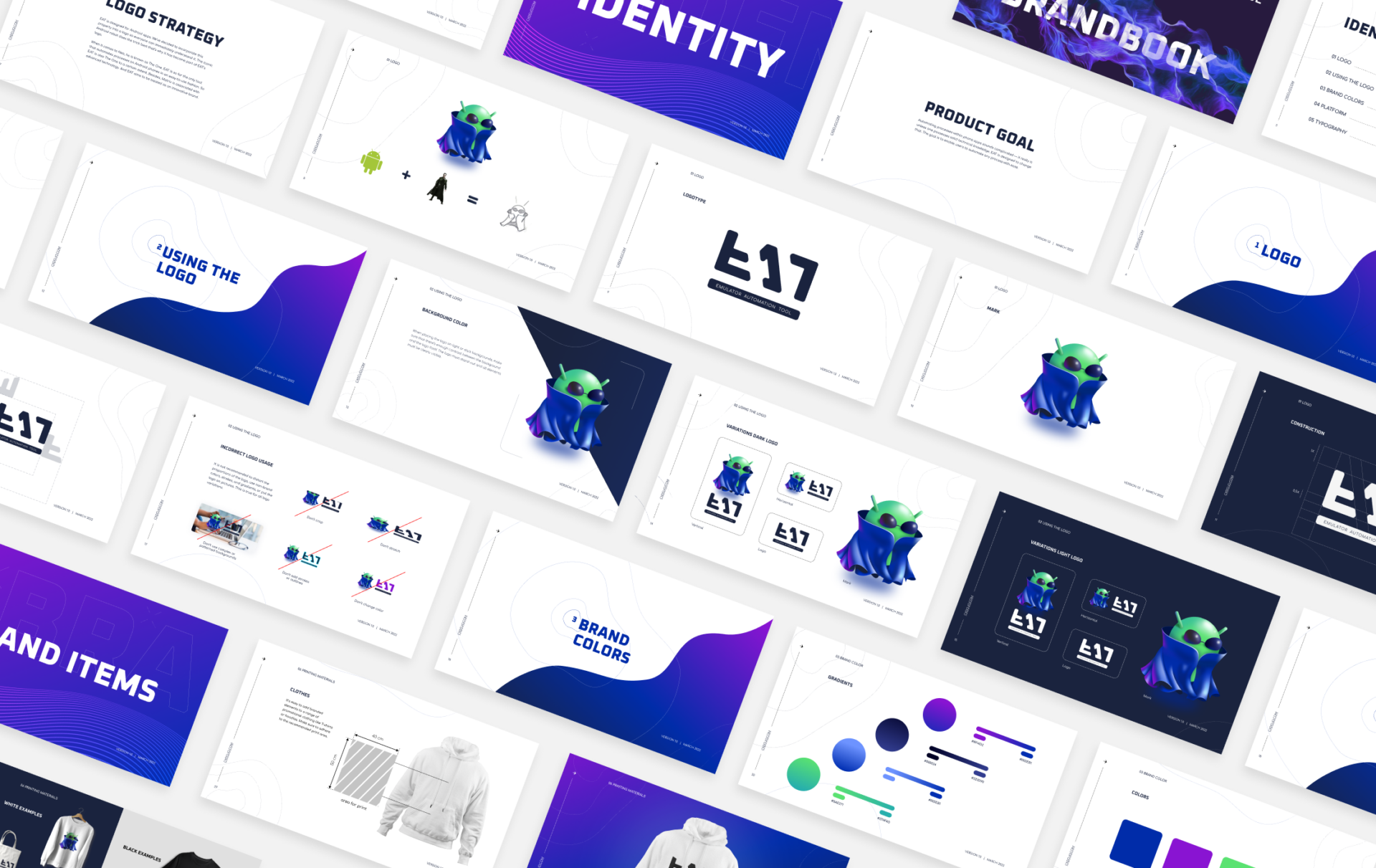
The design process culminated in the delivery of a brand book. It serves as the guidelines for using the brand logo and other elements. Here’s what we included in the brand book:
- Correct and incorrect logo use cases
- Brand colors
- Font system
- Sample usage