RETENTION RATE
PROJECT SUMMARY

CHALLENGE
Facilitate user interactions within an app to avoid abandonment
PRODUCT
A productivity and self-organization app
DELIVERABLES
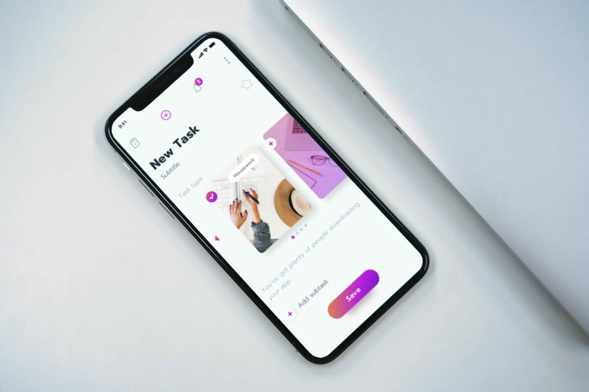
We’ve redesigned the onboarding process and added hints to guide users through the appINTRO
You’ve got plenty of people downloading your app. But, are you paying attention to how they engage with it? Converting potential users to install your app is only part of the job.
Many startups mistakenly assume that users will be excited to engage with their product when in reality, users often don’t understand what’s the value behind it. Failing to understand the product’s value is a reason for app abandonment and one you should take into consideration when building your app and developing a mobile onboarding process.
OVERVIEW
Our customer has developed a special methodology for improving productivity and self-organization, which was based on personal experience, in-depth research, and analysis of various literature. The client wanted to implement this vision and approach in a mobile application that would differ from the standard to-do list apps.
The app would also help users to prioritize and structure their tasks correctly and thereby be more efficient throughout the day.
The product founder possesses years of experience as a business process analyst. Having worked in various industries and helping companies with workflow optimization, he came up with a specific framework and concept of organizing personal tasks more effectively.
CHALLENGE
Initially, after downloading the application, the user didn’t understand how it differs from the existing productivity apps. The users also needed to spend some time familiarizing themselves with the methodology by which it would be possible to effectively use the application. In other words, users didn’t understand the true value of the application.

App engagement and retention were low after the first days. Some people would uninstall the app without even trying the features and the methodology it offers. A considerable % of the users who had the app installed on their smartphones had low activity.
The challenge was to ensure that those people who downloaded the application won’t uninstall it during the first days. Additionally, we needed to make it clear for users about the expected interactions with the app.
SOLUTION
We started brainstorming on what the problem really could be. The CXDojo digital product development team identified the complex onboarding flow as the main problem for app deletion. What does it mean?
Users don’t understand the value of the app — they create accounts but don’t come back to the app. We decided to improve the retention rate by designing a better onboarding flow that would give users direct value in the app.
Initially, a typical user onboarding suggested users read about the methodology and get to know the app in the form of learning slides. These slides contained detailed information on how to work with the application and how to use its features. However, this solution doesn’t work as most people skip reading long introductory texts. While it’s a good idea to have documentation available, a user shouldn’t be forced to go through the documentation to figure out how to use the product. Instead, we wanted to give them some contextual help text. Our idea was to ensure that the user smoothly and step-by-step got to know the app without skipping the onboarding.
First of all, we wanted to remove the learning slides, so that on top of the screens there were tips describing what each element of the app is responsible for. It was one translucent screen that introduced the controls to the application.
In the onboarding process of the app, we aimed to highlight its main features as well as convey the core value of the methodology that became the basis of the application. Additionally, we decided to subtly guide the user through the most common flows by unobtrusively adding help text in the right places.
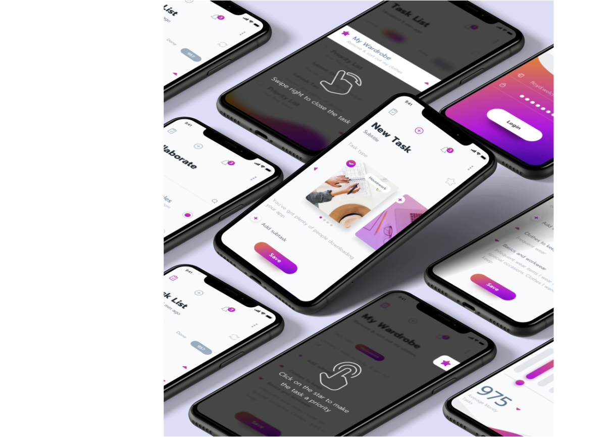
We didn’t want to make boring learning screens but instead create tasks that the user needed to close on their own. Considering that our application is interactive, this was a winning decision. The tasks described what the user needed to do to delve into the process of working with the app.
Upon opening the app, users will be taken through the screens with hints walking them through the app’s main functionality. The hints are pretty easy to follow:
“Swipe right to close the task”
“Click on the star to make the task a priority”
“Click on the task and find the details”
“Swipe right to close the subtask”, etc.
Upon clicking the star “make the task a priority” for the first time, there’s a hint that explains the idea of priority tasks based on the client’s methodology. All these small tasks that appeared during the onboarding process helped users get started with an app as well as understanding its process and methodology.
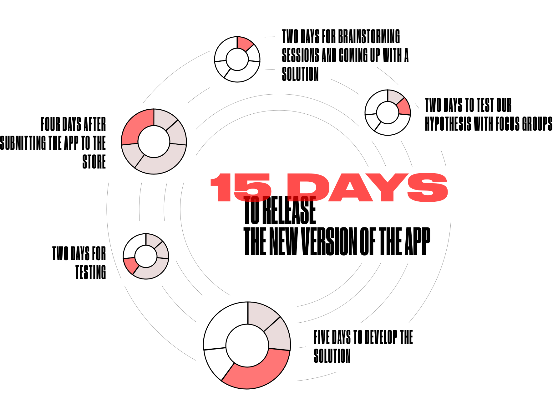
It took us 15 working days to release the new version of the app: two days for brainstorming sessions and coming up with a solution, two days to test our hypothesis with focus groups, five days to develop the solution, and two days for testing. Four days after submitting the app to the store, it has been reviewed, approved, and released.
VALUE DELIVERED
Let's create something
awesomeOUR RECENT PROJECTS
 INCREASE APP ENGAGEMENT
- performance tracking app
- mobile-first development
- data entry automation
- software integration