Current UI Trends: How to Impress Users with Your Designs
What is a trend? It’s a change to something new or different. There are major trends that shape the industry for a year or longer. They have predominantly become the must-haves and no product in the related niche can do without them. Such trends are here to stay. Also, there are hot trends — they come and go, yet have a strong transformational power.
I’ll focus on both types of trends — but in terms of digital product design. For convenience, I’m going to expand on the topic in 2 parts: one for UI trends, and the other one for UX trends.
Let’s start with the visual part and focus on the latest UI trends. Examples included.
Current UI design trends
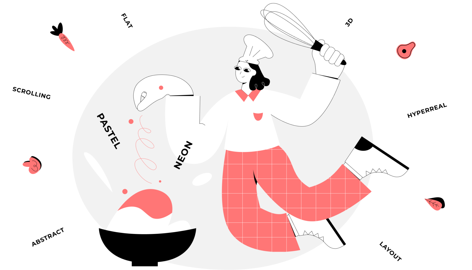
Trending UI design is about changing the patterns and placing boldness at the heart. Of course, the predictable design still works and is already a best practice. But it is somewhat boring.
Designers are moving beyond the ‘typical’ to jump into experimenting with color palettes, textures, and art. They are embracing the eclectic UI trend and center their designs around two extremes.
I’ll group the trends by category — layout, color, form, and style. The best thing about them is that you can combine them all and create a harmonious mix of seemingly incompatible elements.
Non-standard layouts
Trivial grid layouts with static text blocks have been put on the back burner of interface design trends. Now, non-standard immersive layouts coupled with ‘scrollytelling’ are setting the direction for innovative UI design.
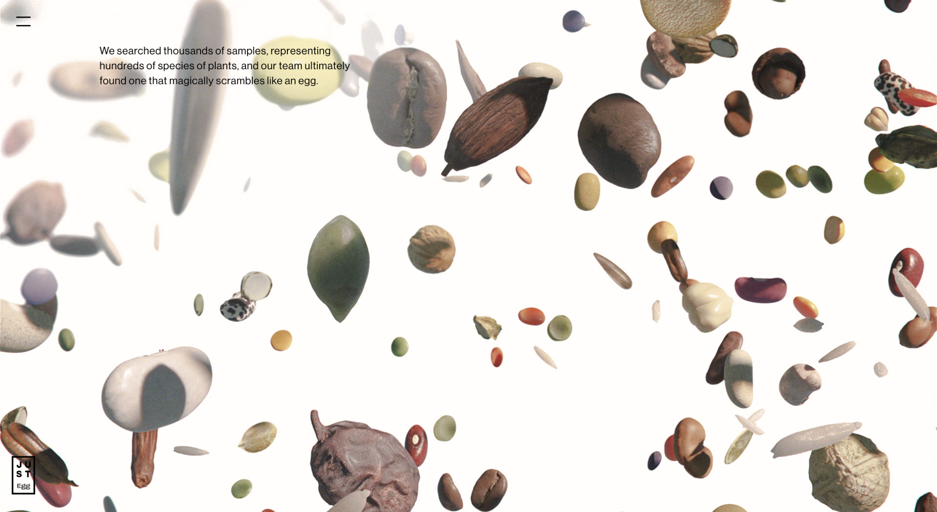
Design by Resn for JUST Egg
Once a user lands on the website and starts scrolling, they activate the dynamic narrative, which takes them on an adventure. With each move, the user uncovers the new element of the interface that contributes to the story told. They become the immediate participants and get absorbed by the events on the screen. This is uncommon and therefore, keeps users focused as they want to get to the bottom of the story.
Trending UI colors
When talking about modern UI colors, it’s difficult — and even impossible — to point to a single color or color palette, which can automatically make the interface design trendy. It all depends on how you align it with other visual elements and whether it corresponds to the product’s nature.
I believe any designer is familiar with the psychology of color. We apply it to trigger the intended user response — be it an emotion or behavior. With carefully selected color palettes, designers can manipulate human perceptions and shift them to the product’s advantage.
Pastel
Pastels are associated with calmness and purity. The impact of pale colors is best felt when they are used collectively.
Minimalist interfaces in muted colors are clean, have a lot of negative space, and communicate a friendly atmosphere. However, if the idea is to create a monochromatic design, make sure to use different hues of a single color paired with the right typography. You can also add a complementary pastel color that is not too contrasting. That way you will likely create a trending UI.
More so, pastels do a good job when used as a ‘canvas’ for the elements that you want to stand out. They fall back and help the user focus on the highlighted image.
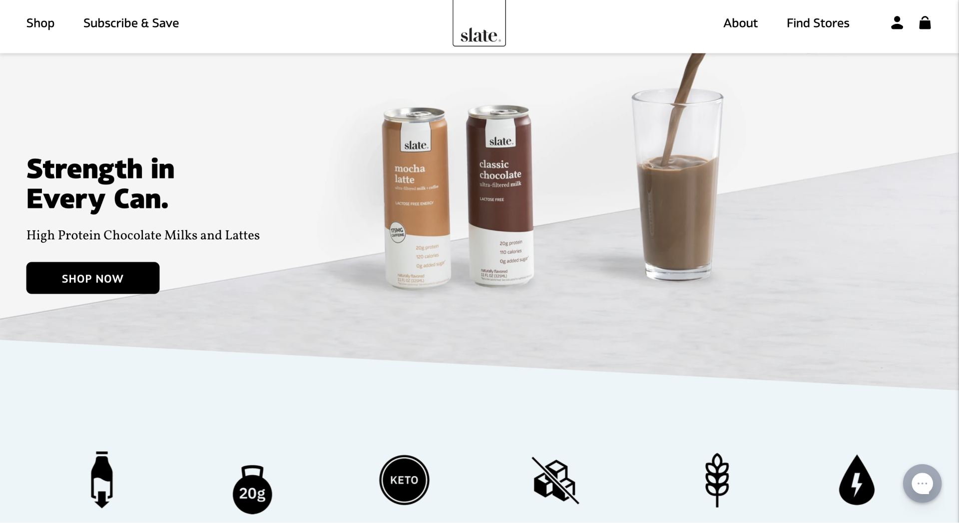
Design by Trellis for Slate Milk
Neon
Neons are attention-grabbing and thus, can be included in the list of bold UI design trends. They enhance interface elements where needed and scream the message out loud. They remind us of night parties, fun, and carelessness.
It is recommended to use neons for accents only to avoid a color clash. They are too bold and demanding by nature. So, if overused in the interface, the viewer may feel overwhelmed and as a result, find it annoying, which in turn, may result in a deteriorated user experience.
Neons are often used in Memphis design that brings the user back to the 1980s. It is popular for its vibrant colors and contrasting shapes.
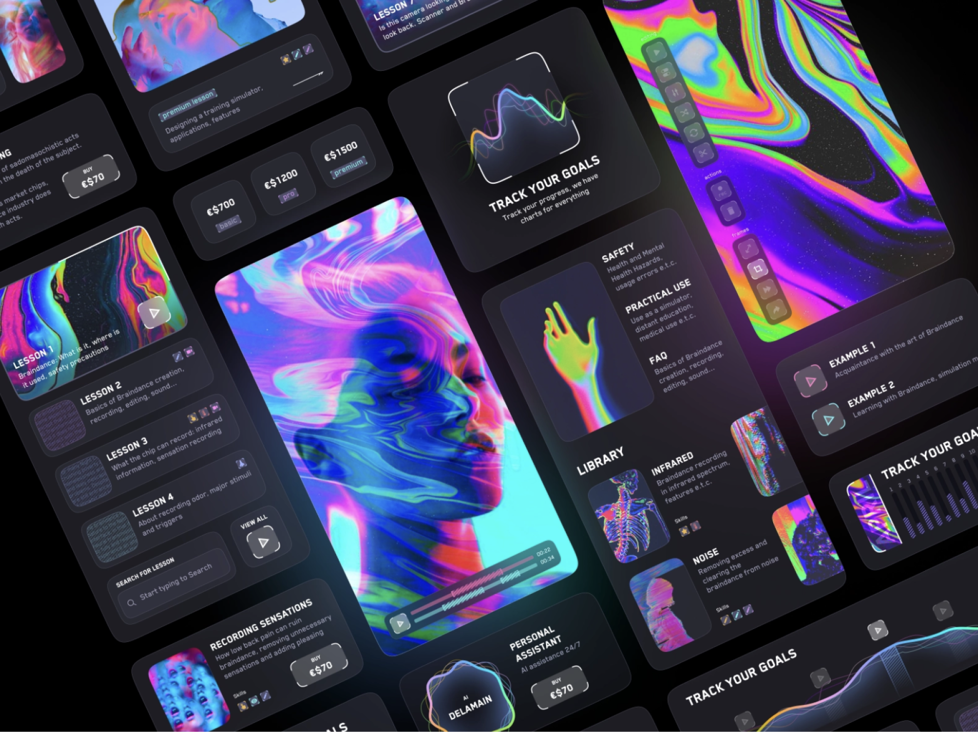
Design by Anatoliy Demyanchuk on Dribbble
The designer can go in one direction — either pastel or neon — or combine them. Even a single neon hue will add an electrifying touch to pastel elements.
Form trends in UI
Ranging from astonishingly realistic to highly symbolic, a multitude of design approaches are making the waves today. It’s very empowering because of the creative freedom that comes together with these new UI UX trends. Every designer can find something that resonates with them and craft genuine digital artwork.
Abstraction
Here, the designer can unlock their inner Pablo Picasso and add a distinct style to the product’s design. Abstraction is not tied to real-world imagery and therefore, is perceived by people in their own way. You can play with non-standard shapes, lines, and colors, combining them in the boldest ways in a bid to create a trending UI design.
Often, abstract illustrations convey little meaning, but we can’t stop looking at them. We examine every small detail, trying to grasp the concept.
Abstraction goes well with a flat design, whereas the color palette can be bold.
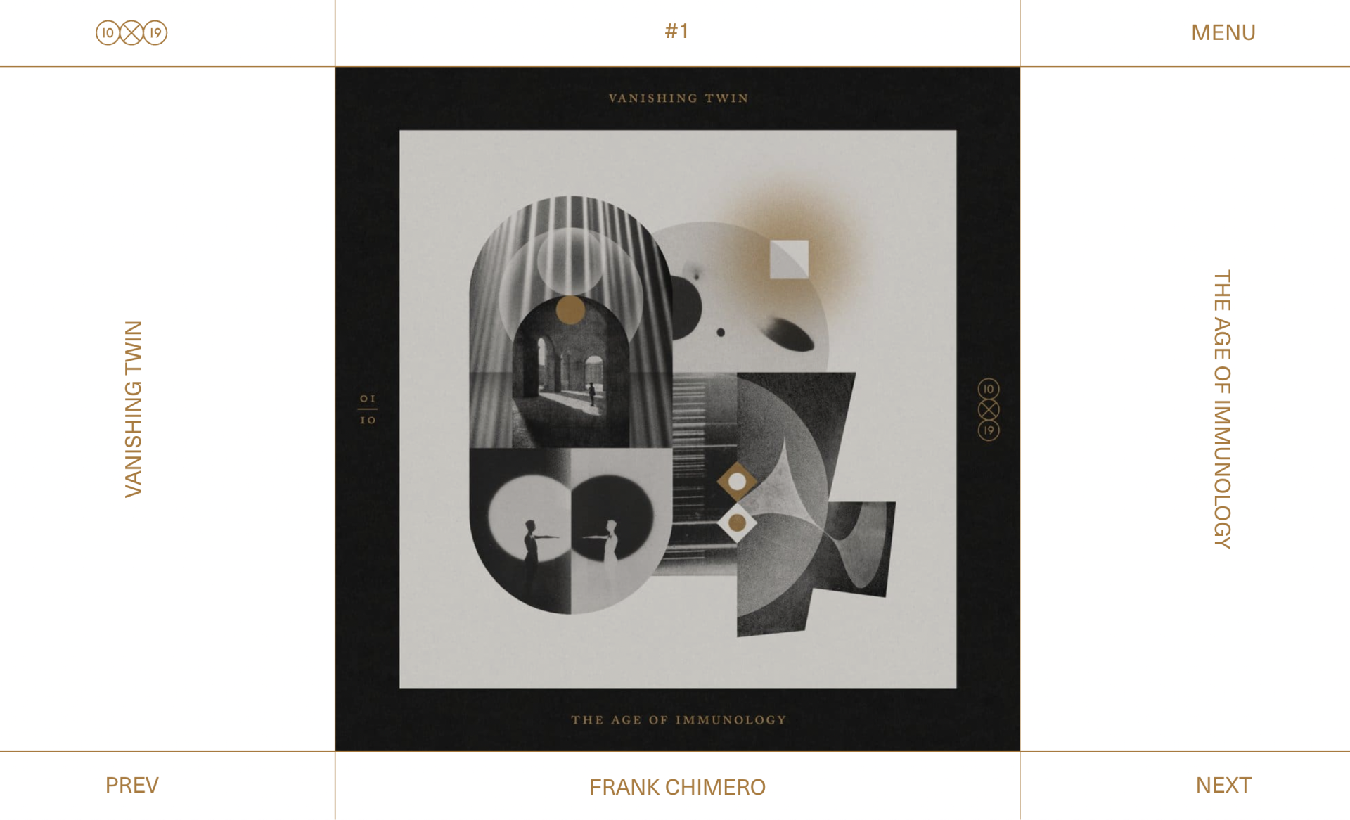
Inspired by 10×19
Hyperrealism
It’s all about details and realism. Hyperreal elements are more emotional than abstractions, which can be both good and bad. To create an impactful hyperreal illustration, a designer takes a fresh look at the object and pays close attention to its textures, imperfections, patterns. They then mimic the real object and can even exaggerate some details.
Combined with 3D effects, hyperreal images can enhance the immersive user experience and create the illusion of a new reality.
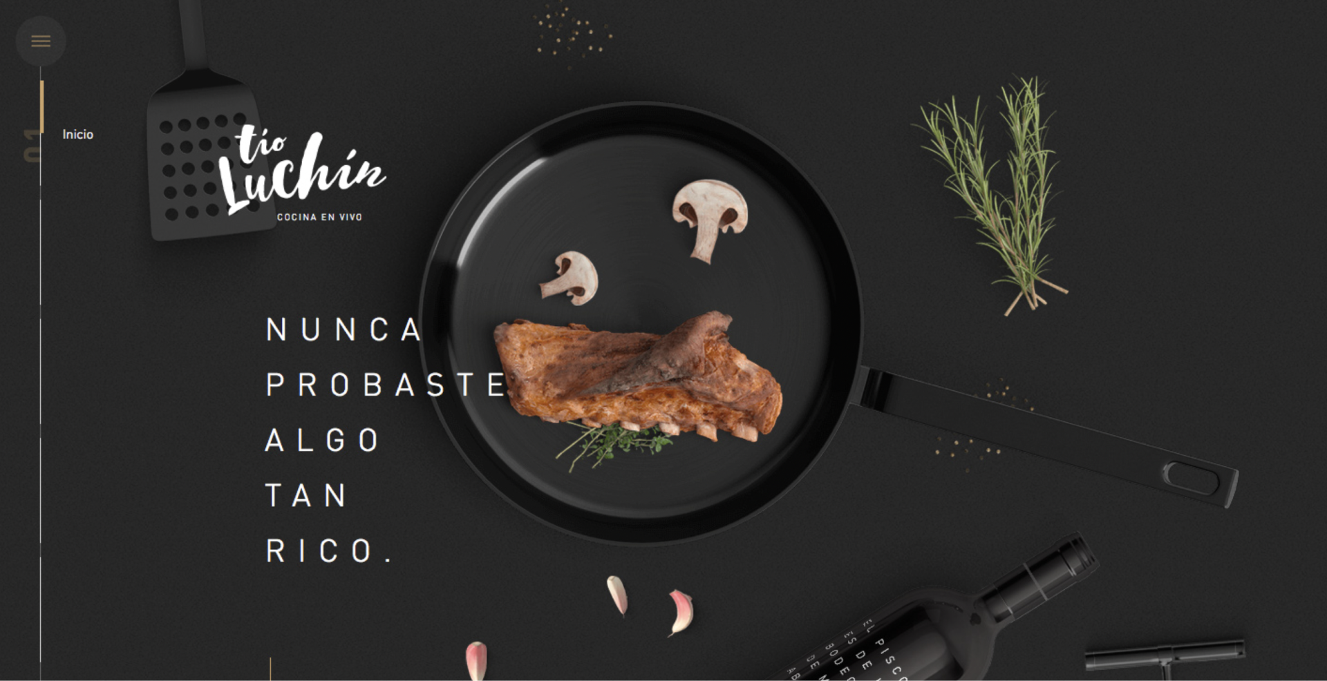
Design by estudio/nk for Tío Luchín
Once mixed, abstraction and hyperrealism can make for a highly futuristic and modern UI design.
Modern UI styles
Over its history, design has gone through many transformations, trying on different styles — the post-modern 80s with pixelated elements, contrast-rich aesthetic of the 90s, skeuomorphism, flat design.
Trends are cyclical. And you can still use these styles in modern designs.
Flat
A flat UI design trend is here to stay. Its focus is on simple shapes, minimal textures, and two-dimensional objects. Flat designs are centered around functionality. All decorative elements are seen as clutter that makes information difficult to scan.
But even if you are a fan of minimalistic flat designs, it won’t hurt to make them slightly more dynamic with shadows and gradients. Experimenting with rich tones or highlights will breathe new life into logos, icons, illustrations, and even type.
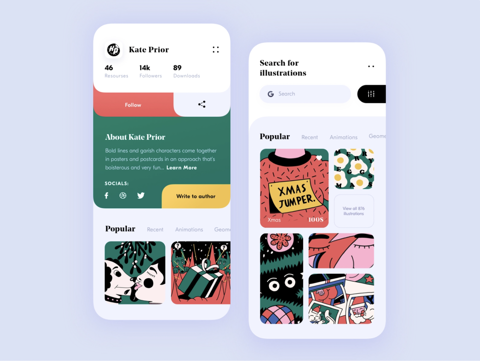
Design by Toma Li on Dribbble
3D
Expect to see the rise of a 3D UI trend in everything — from typography to icons to illustrations. This is a surefire way of getting user attention. Bold designers can try combining hyperreal elements with 3D effects and motion for a stronger impact. This is something that your visitors will clearly remember.
Or, you can dive into neumorphism. Its central focus is on making interface elements look as if they were real. There’s no exaggerated realism in such designs. They just resemble physical objects and materials they are made from. This adds a sharp modern touch to the product’s UI.
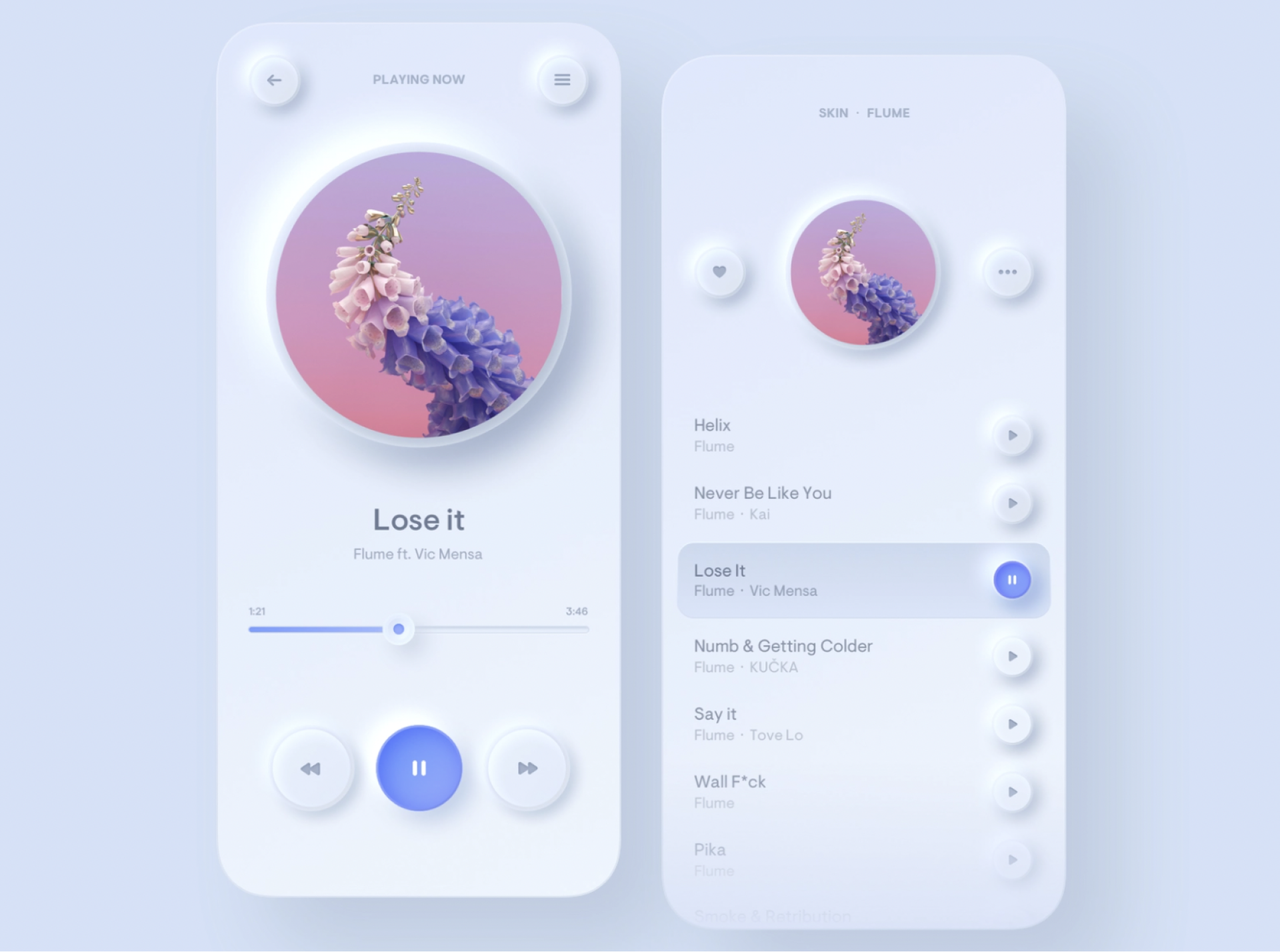
Design by Filip Legierski on Dribbble
It’s now more common to intertwine the styles. All-flat designs look insipid, while all-3D ones are too bulky. The key to success here is a perfect balance between the two UI UX trends.
Mix’em all
“Don’t try to follow trends. Create them.”
Earlier, designers were only groping for the right path and used UI design trends in a cautious manner. If they had an idea to use abstractionism, there was no room for other forms and shapes. Now, it’s finally time when designers don’t have to play by the rules. Feel free to mix anything you like.
In trying to wow users, all methods work. Treat the design process as a puzzle game. Take different trends from all the above categories and put them together as pieces of the puzzle. If they go well together, that’s it — you’ve found your formula for success. If not, try other combinations. As simple as that.
As you now know, there’s only one major trend in UI design, and it’s experimenting. Are you bold enough to use it?
Author
back to all postsOUR RECENT PROJECTS
 Custom Logo Design For An Android App Emulator
- gaming app emulator
- logo concept & design
- brand identity
- brand book
 Enhancing Platform Usability with UI/UX Design
- gaming app emulator
- usability improvement
- data hierarchy
- visual design


