HOW TO INCREASE USER ENGAGEMENT: A THREE-STEP STRUCTURE
Picture such a situation: you install the application, and the first thing you are asked to do is register. Don’t you find it annoying when you need to enter your email, create a password, and share your private data before you even know the essence and the value of the app?
Quite often, it results in deleting the app without even giving it a try. As a result, it leads to poor user engagement. Think about it like this: the app market is oversaturated. Apart from technical issues, there is also a number of other reasons why users churn:
- Lack of delivery of the basic product value.
- Ineffective first experience.
- Inability to motivate users.
If your app requires an account before the user can interact with it, provide a valuable user onboarding experience. The so-called hook will arouse interest in the product and elicit further interaction between the user and the app. Otherwise, they might get demotivated and not provide the information necessary for registration. This will result in lower conversion and engagement rates.
There are a few ways in which you can optimize user onboarding:
- Not asking for registration from the very first screen.
- Not forcing any email confirmation.
- Provide value and show users what benefits they should expect.
Based on the example of one of our recent projects, we would like to introduce you to our three-step structure on how to increase user engagement and retention.
ABOUT THE PROJECT
While traveling the world, our client faced the challenge of finding kid-friendly restaurants. It turns out that the availability of such places is not a common thing in many countries and cities. He spent time searching such restaurants, exploring their web pages, and reading reviews to find the right one. “Wouldn’t it be great to have all of them available in one place?” he thought. With this in mind, he created a mobile application that would allow us to find such restaurants when traveling with kids easily. So, we helped with creating a digital strategy for this product idea.
HOW TO INCREASE USER ENGAGEMENT?
Apart from mobile application development, our team was responsible for the entire customer experience. Our client wanted to start engaging users from the very first version of the app, gather relevant data, and update the service based on the received feedback.
In a nutshell, the main focus was to lead the user unobtrusively from the pre-register phase to full interaction with the app.
STEP # 1 – MAKE USER ONBOARDING VALUE-ORIENTED
We wanted to present the app’s benefits before asking users to register. The idea is to let customers understand how useful the app is for them and whether it’s worth wasting time registering on the first screen. At this stage, the user gets the minimum functionality from the app but doesn’t instantly prompt to create an account. Time is priceless, and people want to know if they will spend it profitably. Simply put, your users will immediately know what they get from your app without demanding anything in return. When users understand your app’s benefits first, they’re more likely to register the app.
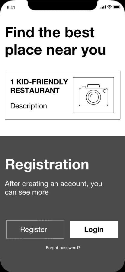
As part of our project, when a person downloads the app, the first thing they get is to try the app’s basic functionality. In our case, the application shows one kid-friendly restaurant in the neighborhood. Instead of forcing users to create a new account straight away, we let them try the app and see its value. Such an approach ensures that users get to know your app and what problem it will solve.
STEP #2 – REWARD YOUR USER AFTER REGISTRATION
The next step is registration itself. After the user creates an account, we reward them by giving them a little more.
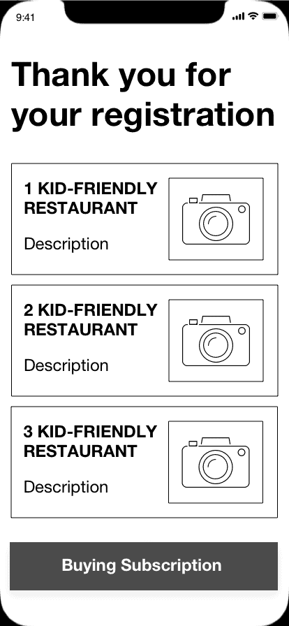
Instead of one restaurant, we now show three restaurants. Thus, there’s no need for users to log in each time they access the app. The moment they open the application, they immediately see three kid-friendly restaurants in their location.
The third step allows buying our subscription, which includes the full package. The idea is that you can subscribe only after trying the app’s key functionality (step one), and only after that decide whether you want to register and try the premium version.
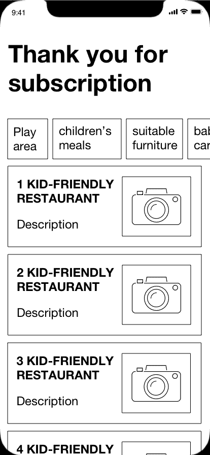
In the full package, there are advanced options, the use of filters (such as the availability of baby carriage ramps, suitable furniture, children’s meals on the menu, a play area, and others), access to the entire list of kid-friendly restaurants and their descriptions, etc.
CLOSING THOUGHTS
Smoothly adding functionality lets users understand our service and decide whether they want to spend time interacting with the app. With each step, we receive different statistics and get to know our users better.
That is to say, if a user installs the app, tries the basic functionality but doesn’t register, then we need to optimize the first step so that there are more registrations. Accordingly, the more registrations, the more chances that the user will buy a subscription. This structure is just one way to boost user engagement, increase app retention, and improve app stickiness.
Want to learn more about how to increase brand awareness, user engagement, and improve product performance, read our recent case studies.
Need help increasing user engagement or assistance with your project? Contact CXDojo and tell us about your business idea.
Author
back to all postsOUR RECENT PROJECTS
 INCREASE APP ENGAGEMENT
- performance tracking app
- mobile-first development
- data entry automation
- software integration


