PRODUCT CATEGORY PAGE DESIGN: BEST PRACTICES
Many people search for the product they are looking for but don’t know which product category page design is best. This leads to your business being found by dozens of people. A well-designed, organized category page will make it easier for people to browse products and find what they are looking for.
Let’s look at some great examples of a category page design to help you get inspired.
This blog post will show you 7 examples of site categories to inspire you in your creations for product category page design.
1. APPLE
Apple needs no introduction. The company has had a long history of creating innovative products. It has a large (and loyal) following around the world for years. Every Apple product is a combination of style and functionality. It’s a result of a lot more dedication and innovation.
It is a company that does amazing things, and the product category page design of their website is no exception.
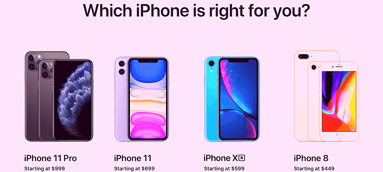
Apple‘s main page uses colorful and clear images of its products, along with contrasting backgrounds that look appealing. Right off the bat, you see the latest iPhones, followed by the iWatch and iPads as you scroll down.
We love their minimalist layout. It doesn’t overwhelm you, even though there is explanation text beneath each product. It’s a win! We love the sleek, modern website design. But it is their iPhone page that is a winner.
After you select the iPhone category, you’ll find all the latest iPhone gadgets and accessories displayed at the very top of your screen. Users can easily scroll through the options by simply clicking on each icon.
Bold and colorful images of the different iPhones crop up on your screen as you scroll down the page. The “Which iPhone is right for you” section, in particular, sets this category page apart from the others.
Consider this: If you click on the iPhone category, you are likely to want an iPhone. What better way to make customers happy than to help them select the best device for their needs and budget?
Apple’s product category page design includes product comparison features. This functionality should be added to your eCommerce pages to allow customers to make faster purchasing decisions.
2.KOHL’S
Kohl’s is a well-respected department store chain. There are over 1,158 stores in all 50 states, except Hawaii. You can be certain that a company this large has a few tricks up its sleeve to get customers coming in. Their online store is no exception.
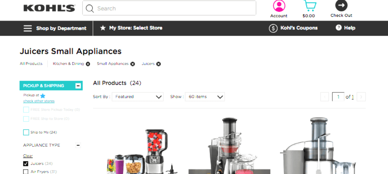
Kohl’s eCommerce site categories are easy to navigate at first glance. The thumbnails show the various product categories in circular icons. To view subcategories, customers will need to click on them.
The product category page design for Kohl is designed with their customers in mind. The page allows them to browse as they wish and gives them direct access to the products they require. For example, their Bed & Bath page has a simple design. At the top, you’ll see five categories that relate to your bedroom or bathroom: Bedding and Bath, Pillows and Mattress, Pads and Toppers as well as Blankets and Throws.
Visitors know what they’re looking at without having to read the category name, thanks to Kohl’s adding high-quality images for every thumbnail.
Customers who are certain of what they wish to purchase can click on the categories and start shopping immediately. You can also view all products under the Bed & Bath page.
Customers can browse the way they like, as we mentioned. Kohl’s could have been more consistent in choosing product images. This is the only area where we can see improvement.
For instance, when you click on the “Bedding” category, you’ll see close-up images of bed sheets, images of bed sheets covering a bed, and packed bed sheets. It would’ve been much better had all the images shown the bed sheets covering beds only — more uniform.
Kohl’s offers a ” Top-Rated” filter, which allows customers to shop based upon customer reviews.
This filter is helpful for a better browsing experience, as customer reviews can have a significant impact on purchase decisions. Customers who are happy mean more business. It is important to think about this on the product development stage, or even earlier – before start your MVP or prototype.
3. HP
Hewlett-Packard Company is well-known for its high-quality information technology products. These include desktops and laptops as well as printers. The company put a lot of thought into designing their online store, just like their gadgets.
HP provides many categories pages that will provide good user experience.
Let’s take a look at their desktop category page. The user is immediately able to see a collage of accessories and desktop computers that HP offers. This page contains high-quality photos of HP’s desktop computers. Users can select from gaming computers to all-in-one computers, so they have many options. Scroll down to see icons for different categories of computers. Users can click on the different categories to see different options for desktop computers.
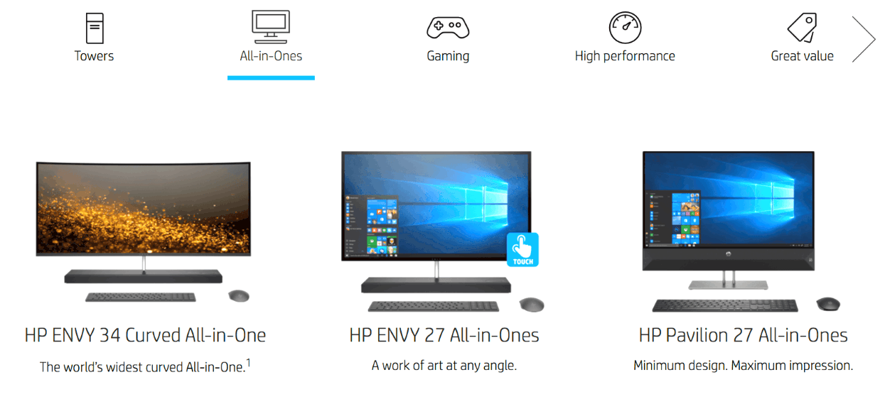
It is visually appealing and simple. It is easy for users to find all their options in one place.
You can choose from different website categories, design and view products within each one. This makes shopping a pleasure. This feature simplifies the purchasing process and guides users to their next purchase.
For people who are just beginning to use computers, HP offers a fantastic user experience.
Category page design is about thinking about your audience and how they will browse your products. You will want to capture the attention of your audience and make them curious about your products, just like HP.
It should be easy for customers to search for products within a category. Your audience will be able to concentrate on the most important things by creating sub-categories in your eCommerce category list.
4. H&M
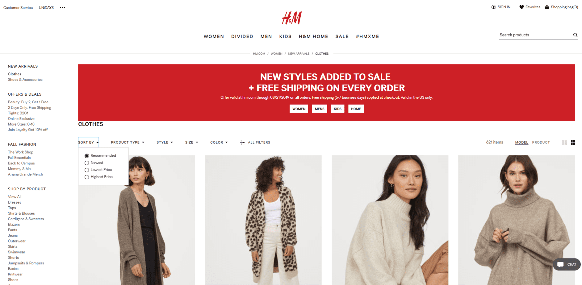
Although you might not have heard of Hennes & Mauritz AB you don’t need to know about H&M. This multinational clothing retailer is the ultimate destination for fashionistas.
The online H&M store looks similar to the physical store. It features an uncluttered layout that is dominated by white, and images of models in their clothes and accessories.
The company does an excellent job categorizing its offerings. There are sections such as “Offers”, “Trending Now,” and “Shop by Product.” Other filters, like size, pattern and color, can help you narrow down your search.
H&M has a unique “New Arrivals” section, which works wonders to draw more visitors to their website. This informs interested shoppers about every new product that has been added to the store since their last visit.
The company also follows the most important product category page design best practices such as high-quality images and subcategories breaking down the categories, and adding filters to reduce product search.
All filters allow users to shop in a few clicks. Users won’t need to scroll through many pages in order to find new products. You should also include a filter for “New Arrivals”, as we have discussed. You can also experiment with product types.
H&M has a “Trending Now” category that highlights the latest trends relevant to that sub-category. This page will give you inspiration on how to style H&M clothing and accessories. It’s definitely an effective tactic to ensure an amazing user experience.
5. STAPLES
Staples – an American office retailer that sells office supplies and related products. Its official website offers a wide range of office supplies and furniture, including pens and chairs.
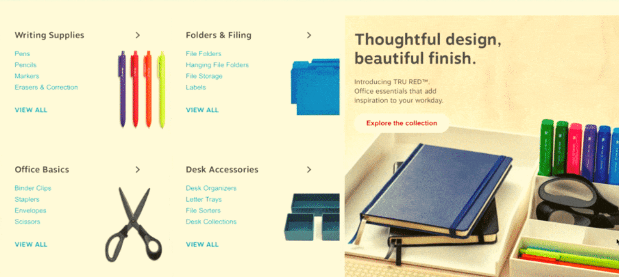
Staples’ product category page design is more busy than other companies. They balance it by using different font sizes, colors, and make it easier to distinguish between product categories.
Staples has taken a very visual approach to their category pages. Each category page includes a product image, clickable links to products within that category, and a description of the category.
For instance, take a look at the “Office supplies” page.
You’ll find the products are broken down into several broad categories like Writing Supplies, Folders & Filing, Office Basics, Desk Accessories, Office & School Supplies, and so on.
Each category contains a different type of product. The “Writing Supplies” section contains subcategories such as Pens, Pencils and Markers, Erasers and corrections.
Scroll down to see different categories for brands. It’s easier to search for products by brand name when you want to purchase products from a particular company. This is also common for stationery.
This simplified approach makes it much easier and faster to find the information you need. Users can quickly find the information they are looking for. Users can search for the right category, then continue looking at products which fall under it. This ensures positive user experiences.
Staples has divided its category pages into boxes in order to organize their products. This is a great trick to help your visitors navigate your website better.
Your information will be organized and labeled so that your customers can easily browse your products. Another benefit is the neatness and organization of your online store.
6. ETON SHIRTS
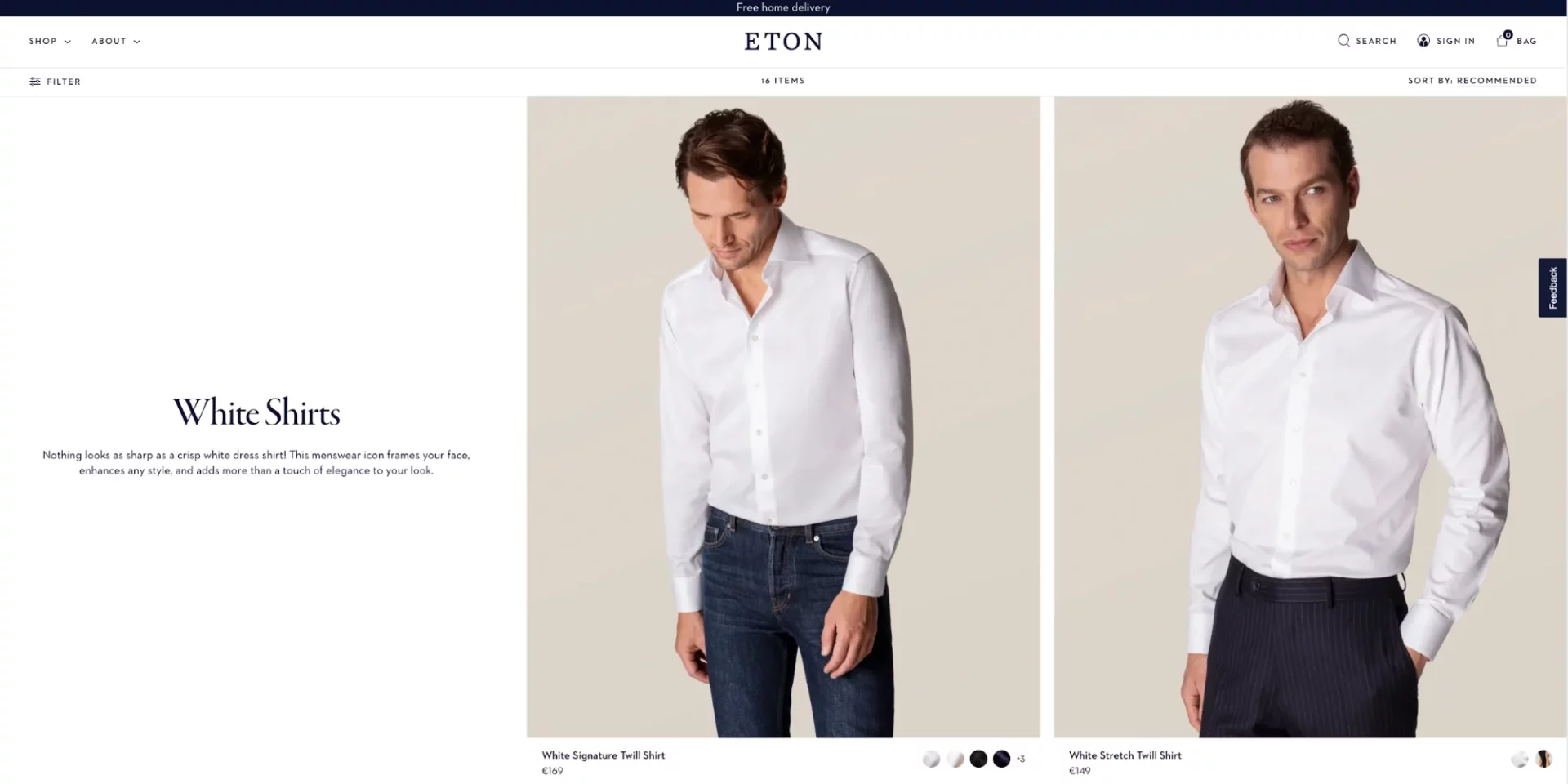
Eton is a global brand with over 1,500 shops in more than 50 countries. It has a loyal customer base because of its extraordinary range of casual and formal shirts.
Large images of men wearing the brand’s shirts and accessories are displayed on the main category page. The screen’s top bar has a small “Shop” tab that displays the various clothing categories.
You can browse all the shirts simultaneously or browse by style (dress shirts and casual shorts), body size, occasion (evening and day shirts), and broad categories such as “New Arrivals,” “Most Popular”, and “Essentials.”
You can see the company has selected the category breakdowns with a lot of care as every option relates to their main product – shirts – rather nicely. What’s more, even the subcategory names are excellent, being focused on shirt styles and prints.
The minimalist design of the product category page design complements the minimalist website’s aesthetic. They use large, high-quality photographs to serve as visual cues, telling the visitor where they’ve landed on the website.
When we say high-quality, it is what we mean. The shirt is clearly visible, with every stitching and button. The images are also consistent in size and don’t clash.
This is actually very clever (and lovely to look at). You can see that category pages are SEO-optimized. This is why customers may find themselves on them without having to visit the homepage.
Visitors will be able to find their way around the site by using visual cues and inspirational banners. This keeps their attention and makes it easier for them to browse your entire store.
Eton Shirts educates their customers about the differences between products, which in turn helps them understand the various categories. Let’s take another look at the image on their website.
The brand tells their customers about the slim and tailored silhouette of its super slim fit. They also give advice on which body types best fit the brand’s slim-fitting silhouette.
This small detail makes it easier for customers to shop. It gives them all the information that they need to make a decision about whether the Super Slim fit collection is right for them.
It is a good idea to give additional information on a category to help customers make better purchasing decisions, especially if they don’t have much knowledge about the product.
7. LOWES
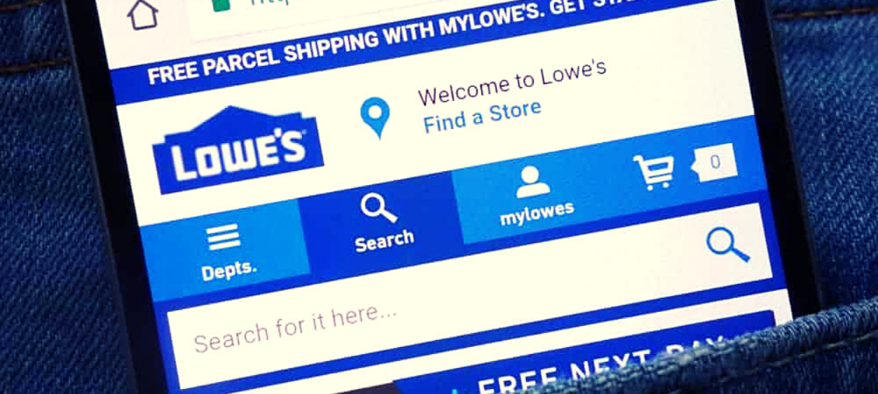
Lowes’ product category page design is a great choice if you want to see simple but practical examples of category page design.
The pages of their categories are clean, organized, and coherent.
Lowes’ category pages on bathroom vanities and vanity tops is a great example. People are enticed to click on the first page by a picture of one of their vanities in use in a bathroom. Scroll down to see the different countertop and vanity options.
You can browse vanities by size or color as you scroll down the page. This arrangement creates an amazing shopping experience. This allows customers to browse based on their needs, regardless of whether they are looking for a particular vanity size or a particular color.
This website categories design works because it is consistent with Lowes’ brand. The photos are all in the same style which creates a cohesive product category design. Lowes also created several ways for customers to shop (colors, sizes, and looks), which makes it easier to find the right product.
Think about the many ways that people will search for your products when you design your category page.
To help you organize your eCommerce category list and create a better browsing experience, you can create different categories like “by color”, “by style” or “by brand”.
CONCLUSION
Your website’s category pages design is an essential part.
eCommerce category pages play a crucial role in guiding customers to the right products, navigate through the site, and even check out products that aren’t on their shopping list.
This is why it is important to think from the perspective of the customer and consider how products can affect their shopping experience.
The role of category pages is crucial in helping people find the right products for your business. When you create a product category page design for your audience, you’ll get more people to visit your site. And we are here to help you, feel free to contact us!
Author
back to all postsOUR RECENT PROJECTS
 Custom Logo Design For An Android App Emulator
- gaming app emulator
- logo concept & design
- brand identity
- brand book


